I enjoy cutting quills in the morning and writing a few sentences, it’s a kind of routine for me when working from home.
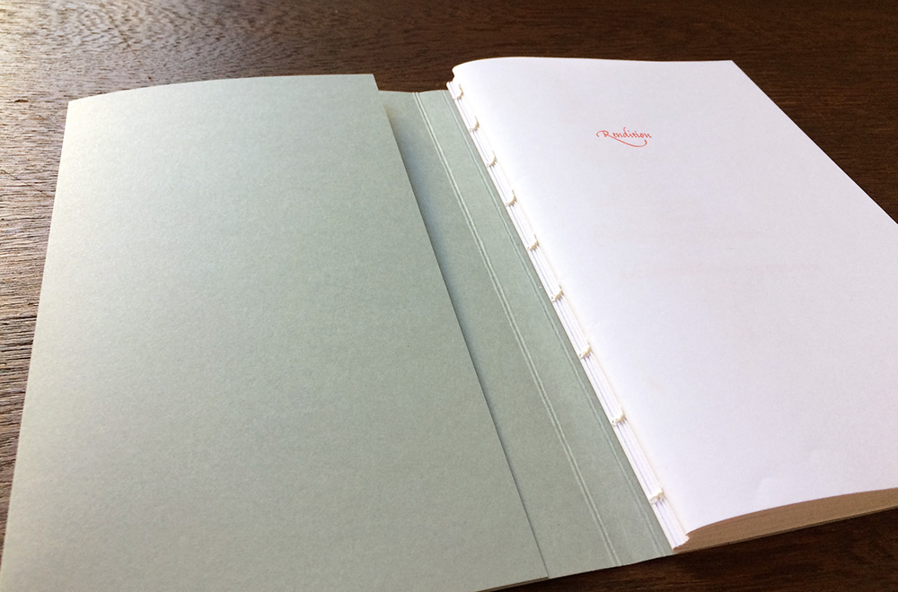
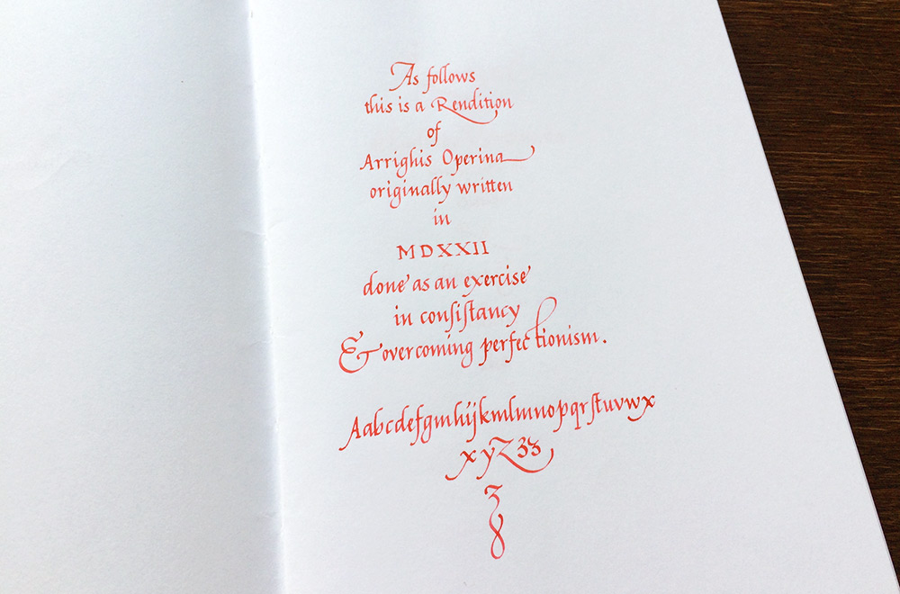
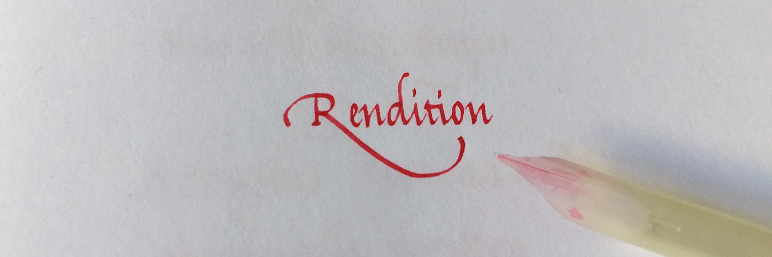
Quills are a material coming from nature, each having individual qualities, resulting in different behaviour when used with ink and paper. To learn more about this, I recently did this project called Rendition.
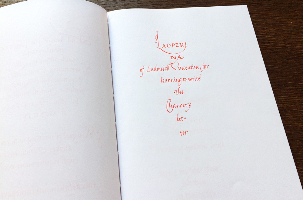
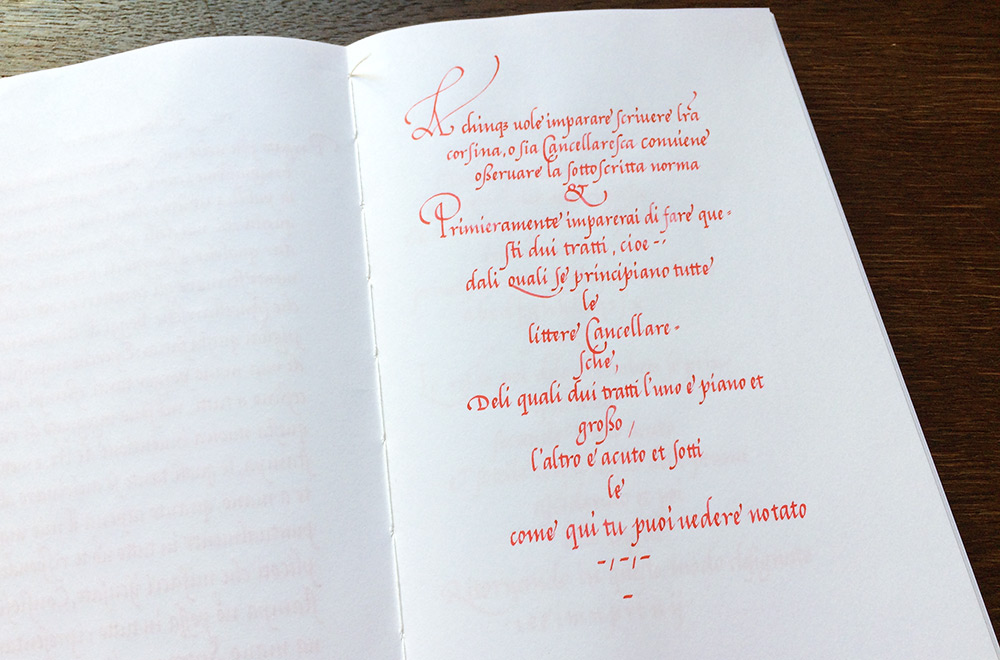
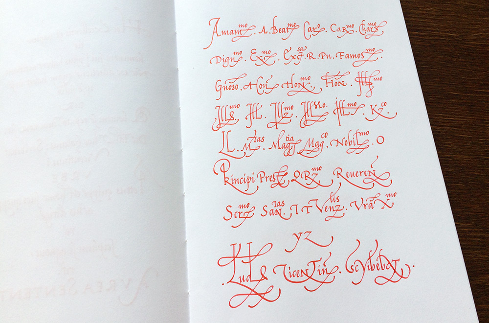
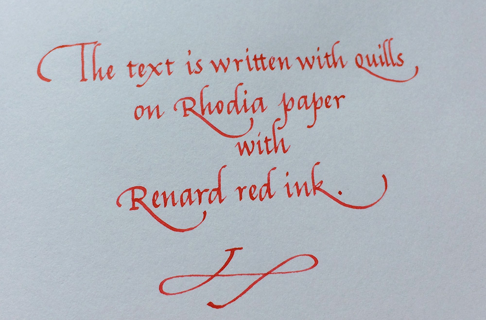
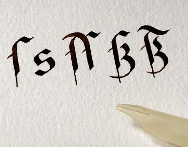
I chose a script which I found easy to write, the Chancery letters from Arrighi. My usual scripts are Blackletters, but they require more concentration on letter shapes. By comparison, Italics seemed straightforward.
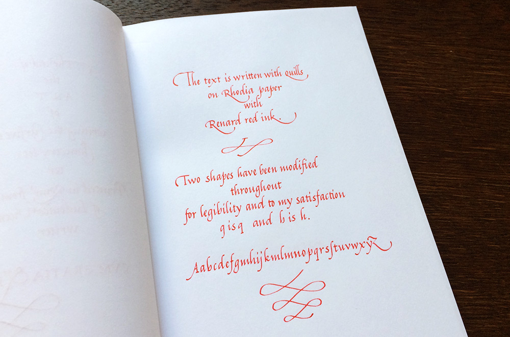
The red ink from Renard was a random choice, I recently bought it cheaply at a flea market. It has low viscosity and works very well with quills on Rhodia paper.
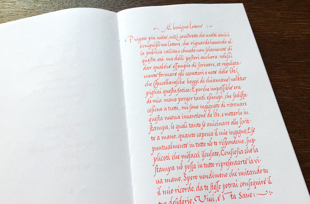
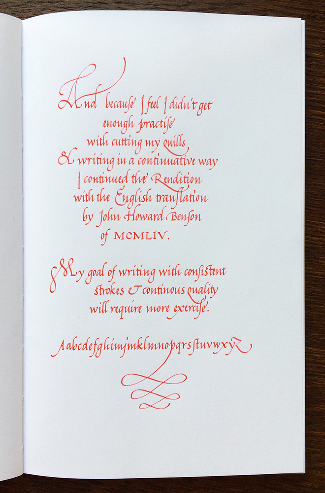
So, I wrote a few sentences of Arrighis Operina from 1522 as a regular (almost daily) practice, I continued with the English translation from Howard Benson; it took about a month to complete the project. Each page of the Rendition is written with a different quill, either freshly cut or from the day before, but dried in-between.
My aim was to obtain a consistent stroke, as well as a consistent ink flow, in other words to have as little difference between the pages as possible.
I didn’t want to worry about copying the perfect page from Arrighi, which turned out to be quite a challenge to overcome. Learning about cutting quills and writing with them in long duration was really what I wanted to work on, but the more I dig into this, the more critical I become. It’s such a big field to explore.
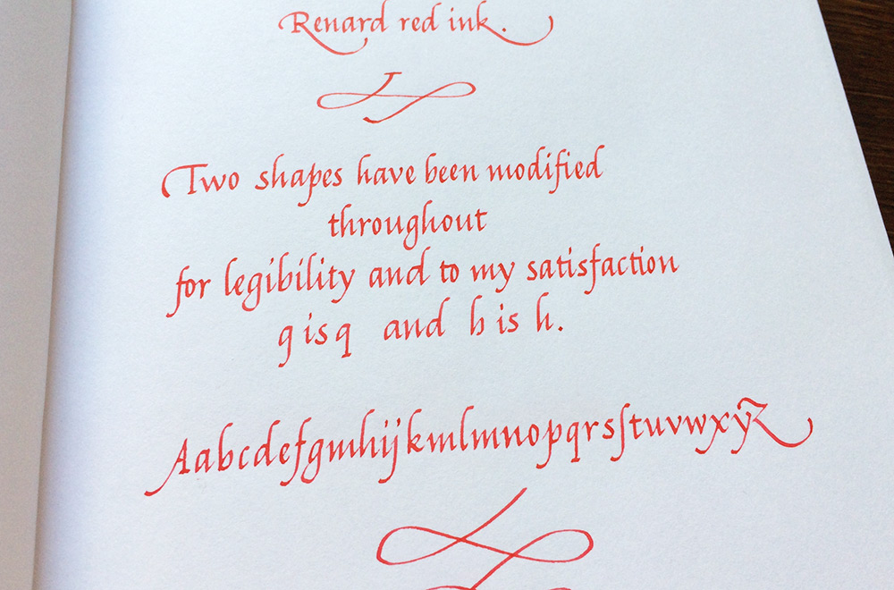
For legibility (and my own satisfaction) I modified the shapes of h and q as shown in the photos below, also mentioned in a descriptive page at the end of the booklet.