The original design of these letters is from a book called Memoriale di Calligrafia, which I found at the Ornamentstichsammlung of Kunstbibliothek Berlin. The book is compiled and engraved [ordinato ed incisco] from Giovanni Battista Cipriani (1766-1839), published 1828 in Rome, Italy.
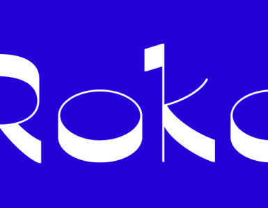
When I flipped through the pages, this very peculiar alphabet caught my attention, as it is quirky and funny and special, but still works with a classical approach. I love the high contrast of the strokes. It is titled with Alfabeto greve.

On the same page, there were some capitals as well, but they were heavily ornamented and they didn’t inspire me to draw them. (I also think they didn’t match the lowercase very well, but that is for you to judge.) My focus was on the concept of the minuscules, which I found worthwhile to study, but they are not designed consistently.
Some details: I liked the little indent in the stems of h, m and n very much, but in my opinion it should be repeated in the r, and possibly in the descender of p and q. The k needs an ascender. The g looks a bit cramped. One last thing to mention: The h and the r could have a serif top left. Not sure what to do with the z, it feels odd, as if it doesn’t belong there. And I love the s.
So this is what I have so far. The project is on hold at the moment, because I need to concentrate on finishing my theoretical elaborations for the final exams of my studies. I might come back later and modify some of the letters, also it would be fun to think of matching capitals and numbers.


June 2022