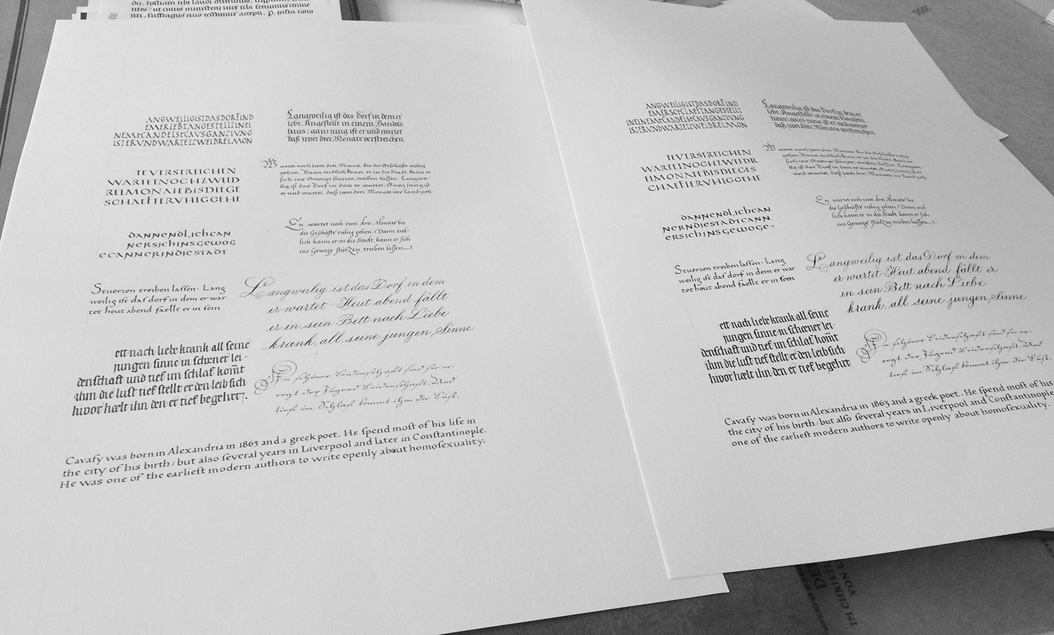
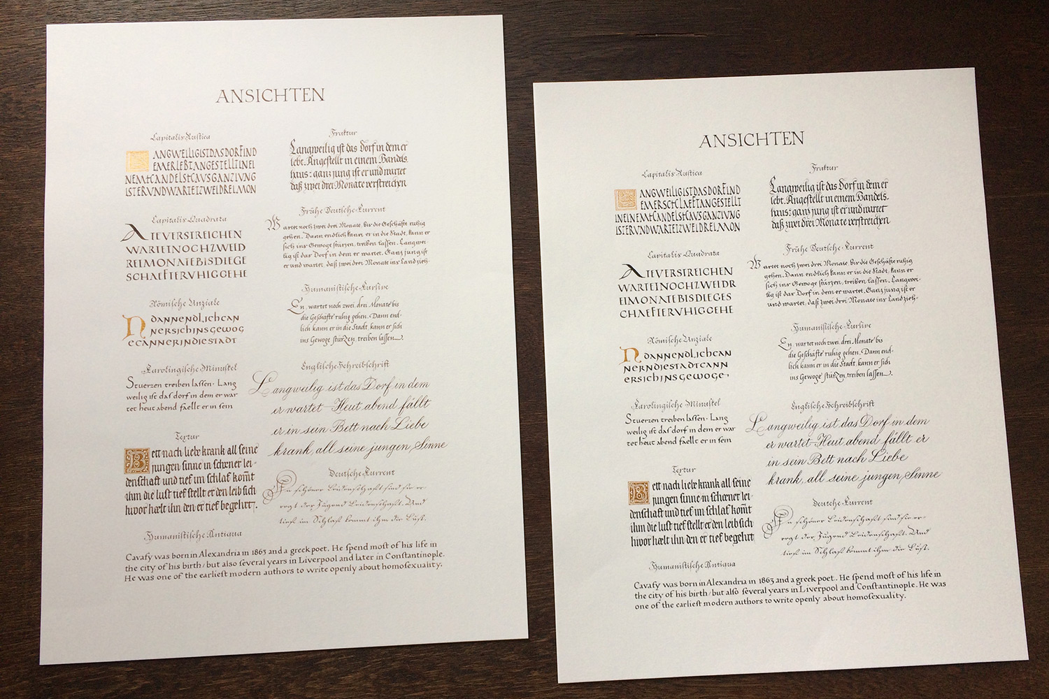
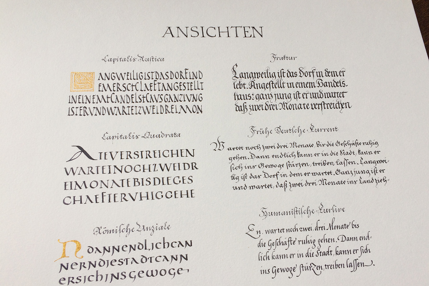
After one month of work I am happy to announce that my new Ansichten poster is ready! Actually, it’s again two of them, one is written with walnut ink, the other one with iron gall ink. For text and layout I oriented closely to my previous Ansichten poster, which I did in 2014/15.
It all started when I was still working as a graphic designer at a publishing company. I reduced my work time to four days per week, every Friday I would go to the library and study scripts. And naturally I also wanted to try and write them myself. For this reason, the first poster back than took almost a year, and it turned out that I eventually used it for my application to study type design.
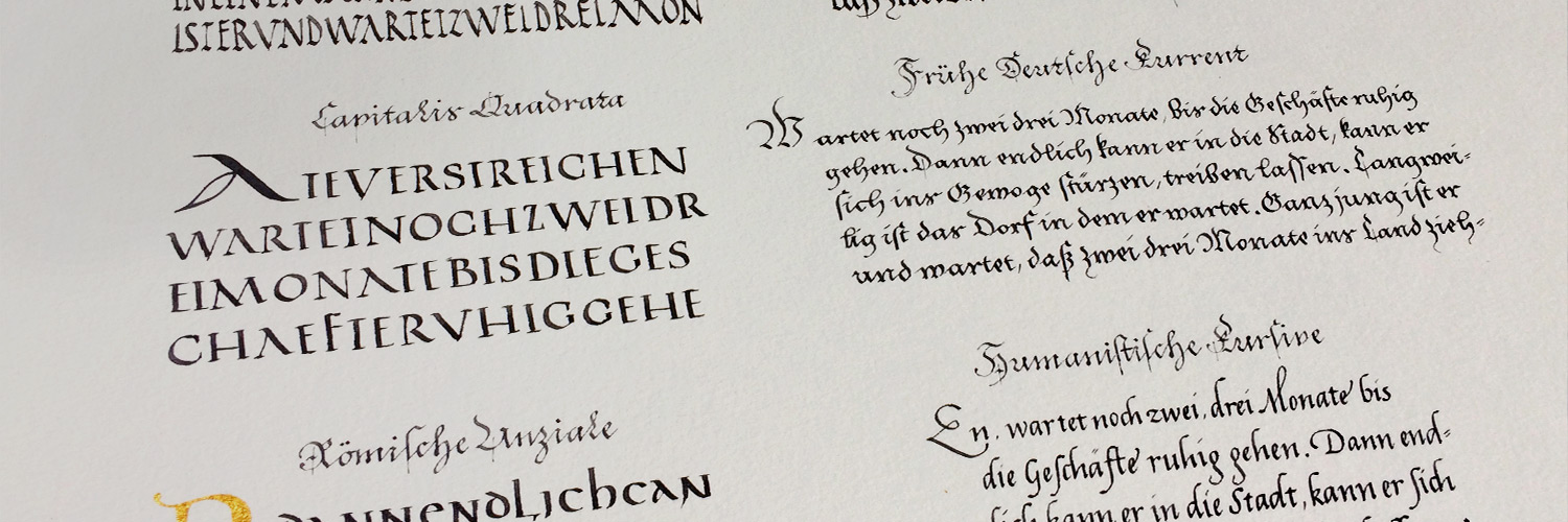
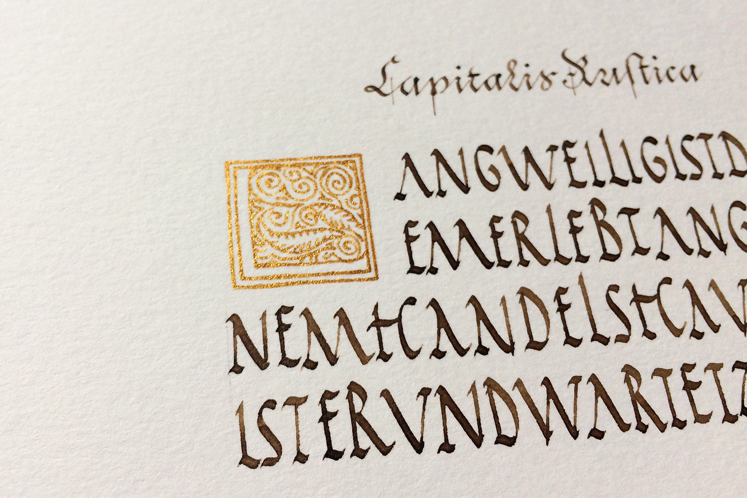
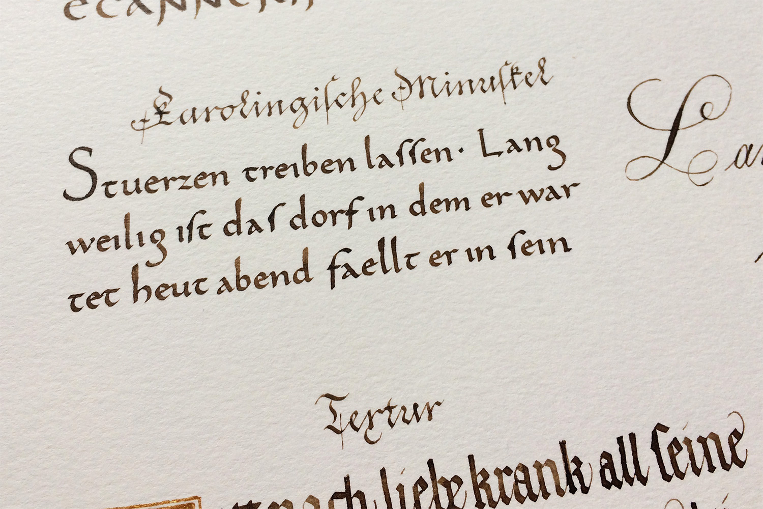
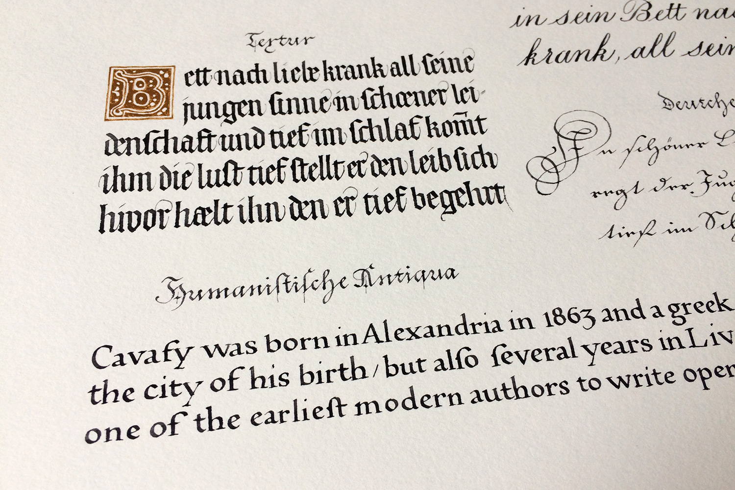
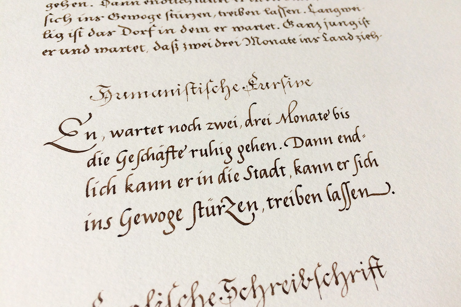
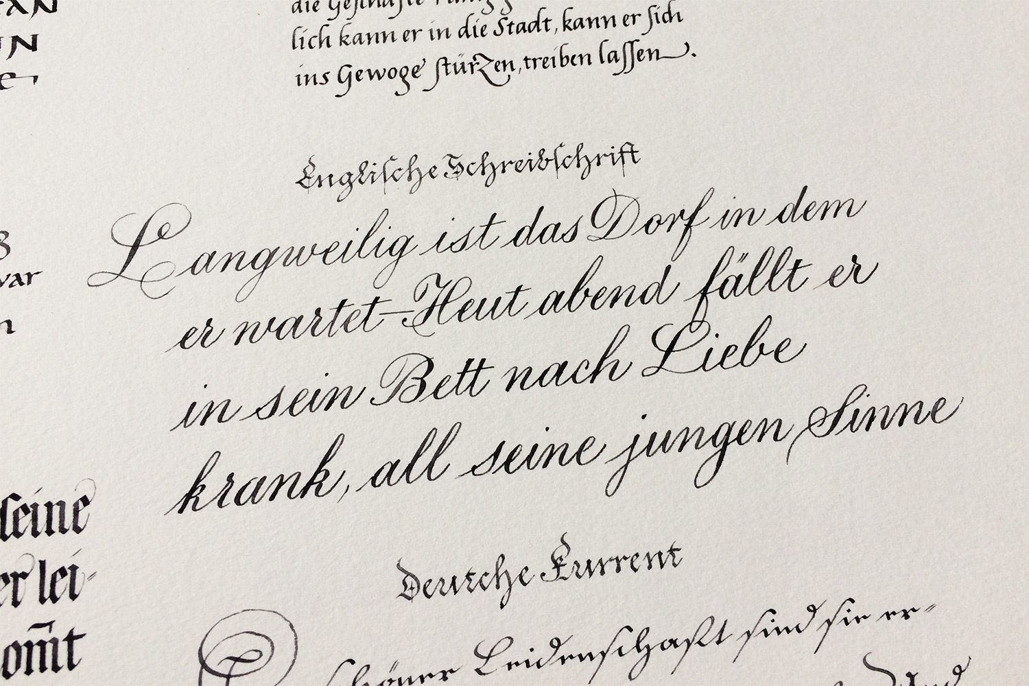
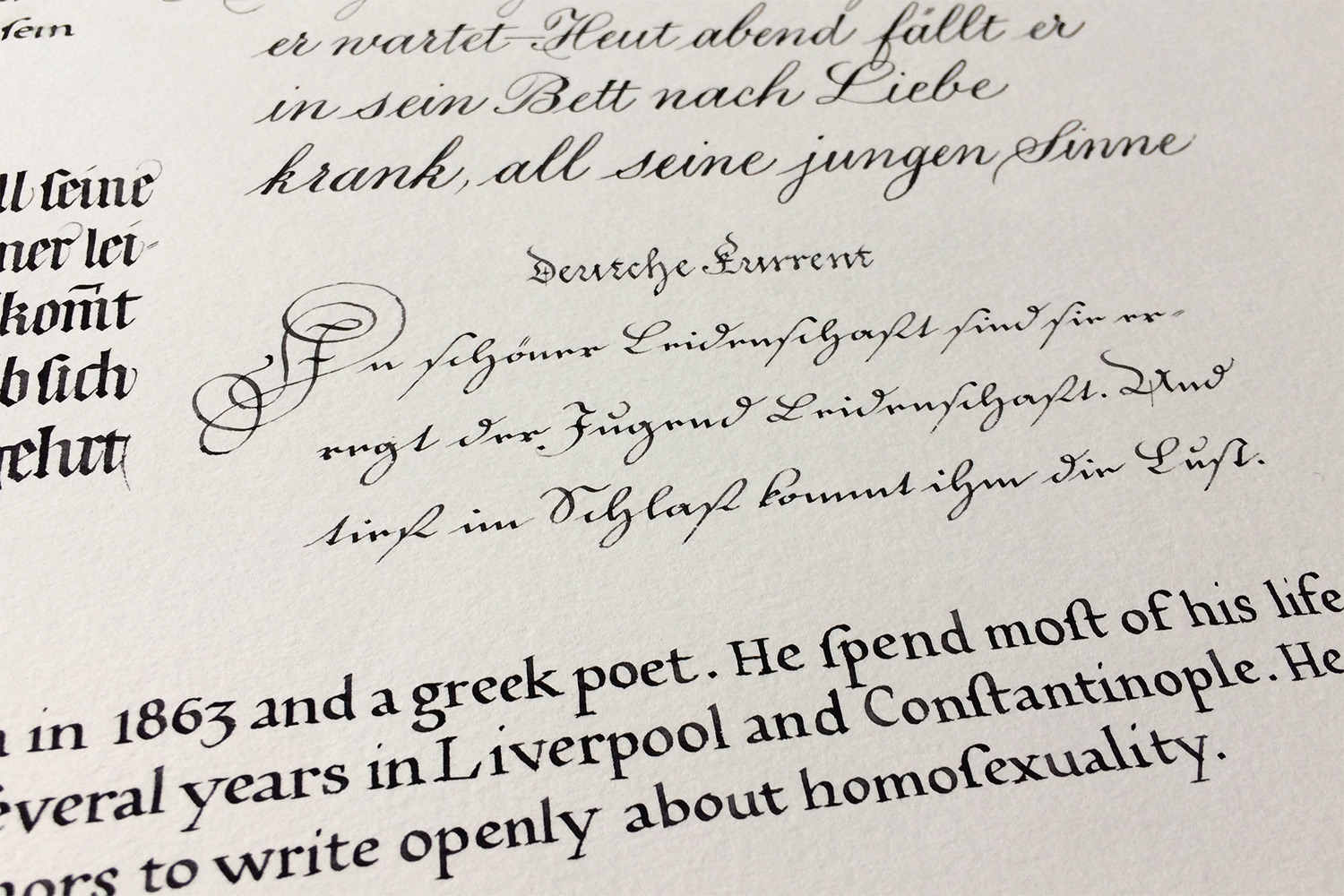
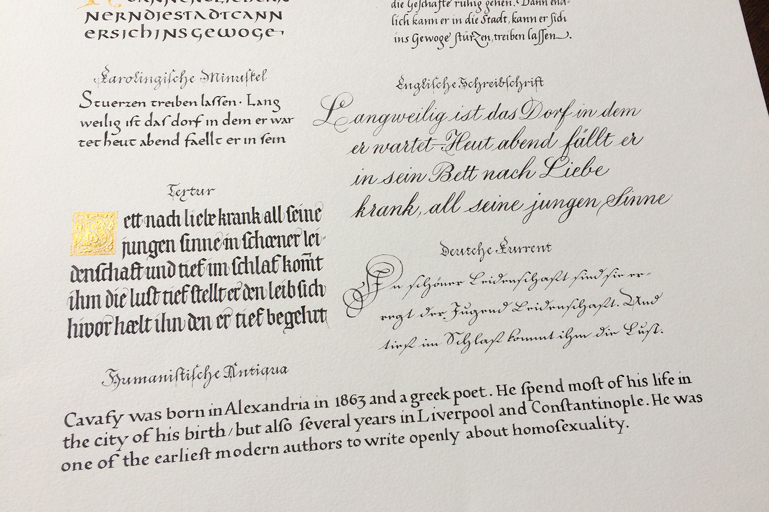
So, after some years have passed and my calligraphy skills developed, I thought it would be a great idea to re-create these posters. This time I wanted to use only quills for writing, and furthermore try to match a realistic writing size. After some intense studying of manuscripts the last years, these aspects became very important to me. I am curious about how the writing masters in the 16th century have been mastering their task. They used to create these kind of posters to advertise the styles they have in their reportoire – some kind of portfolio I would say. This one from Johann von Hagen is the earliest I know.


If you have any questions or comments, I am happy to hear from you!
And yes, all has been written with (many different) quills.

Further editions:
2014/15 – Ansichten I
2021 – Ansichten III