December 2021
A copy of the Italic Copybook – The Cataneo Manuscript – from Stephen Harvard is difficult to obtain. I was waiting for it quite a while, but now I finally own it. This book is a facsimile, containing a reproduction of the original twenty pages from the calligrapher Bernadino Cataneo. He wrote these in 1545 in Italy for an English client. The book contains samples of five scripts:
- Cancellaresca corsiva
- Cancellaresca formata
- Tonda antica (only brief sample)
- Capitalis monumentails (only brief sample)
- Lettre cadeau (only brief sample)
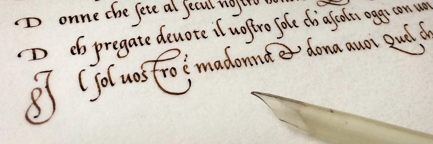
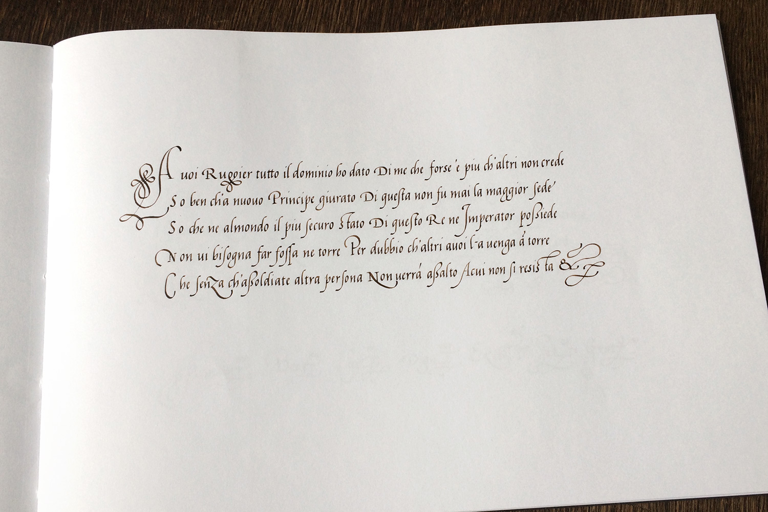
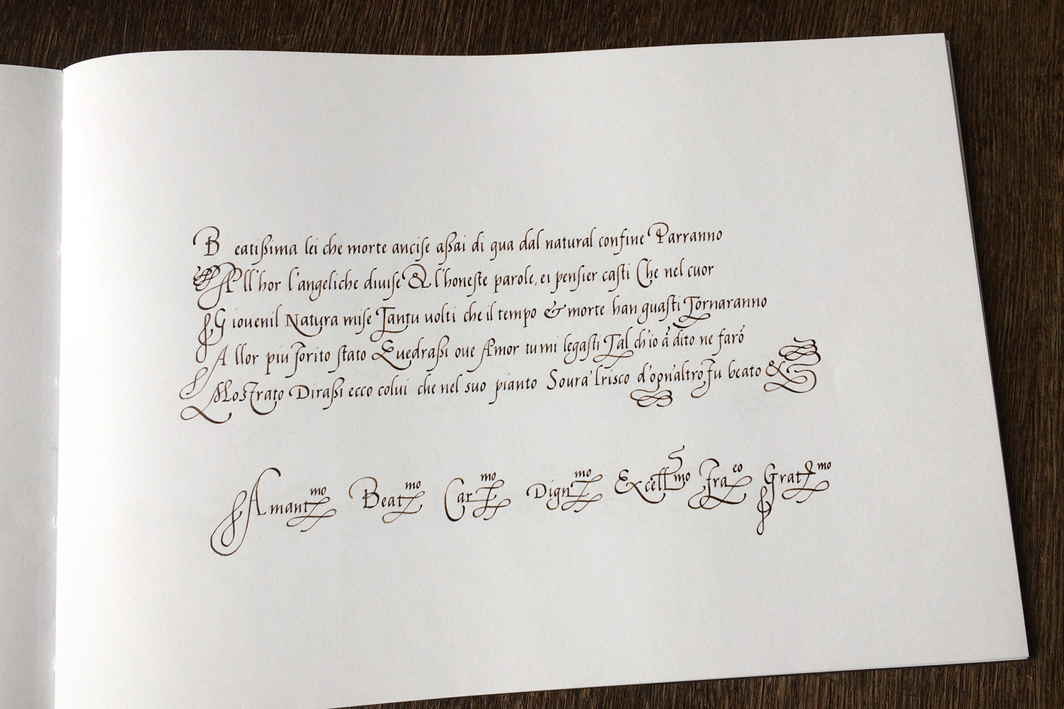
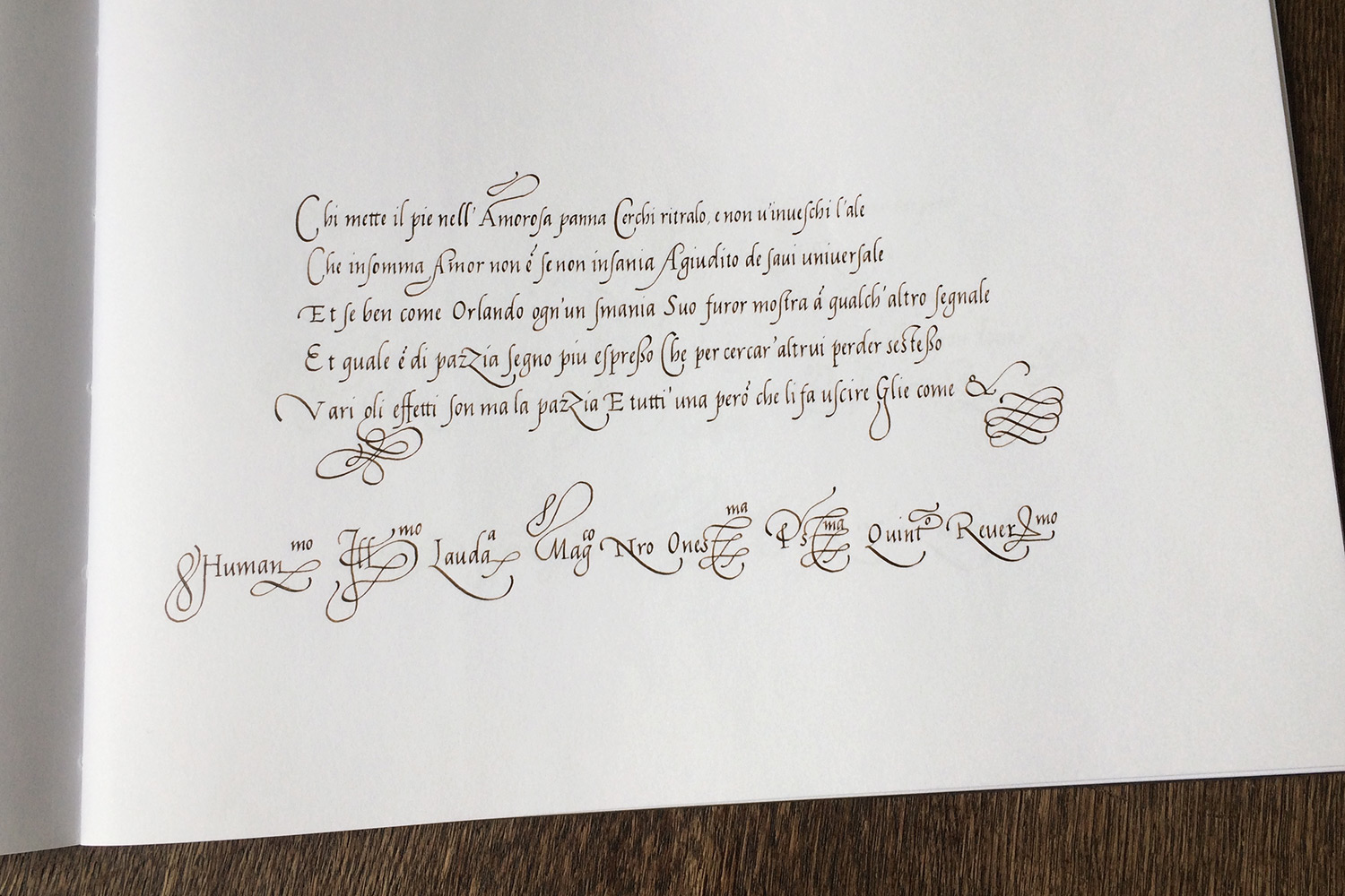
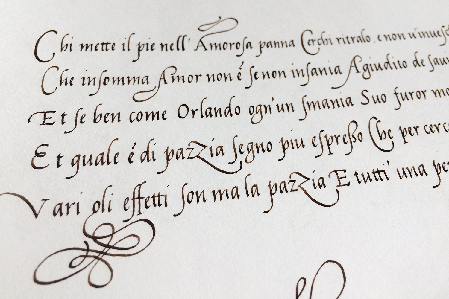
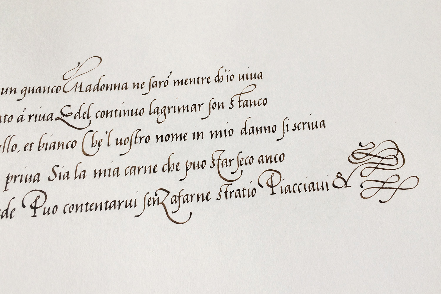
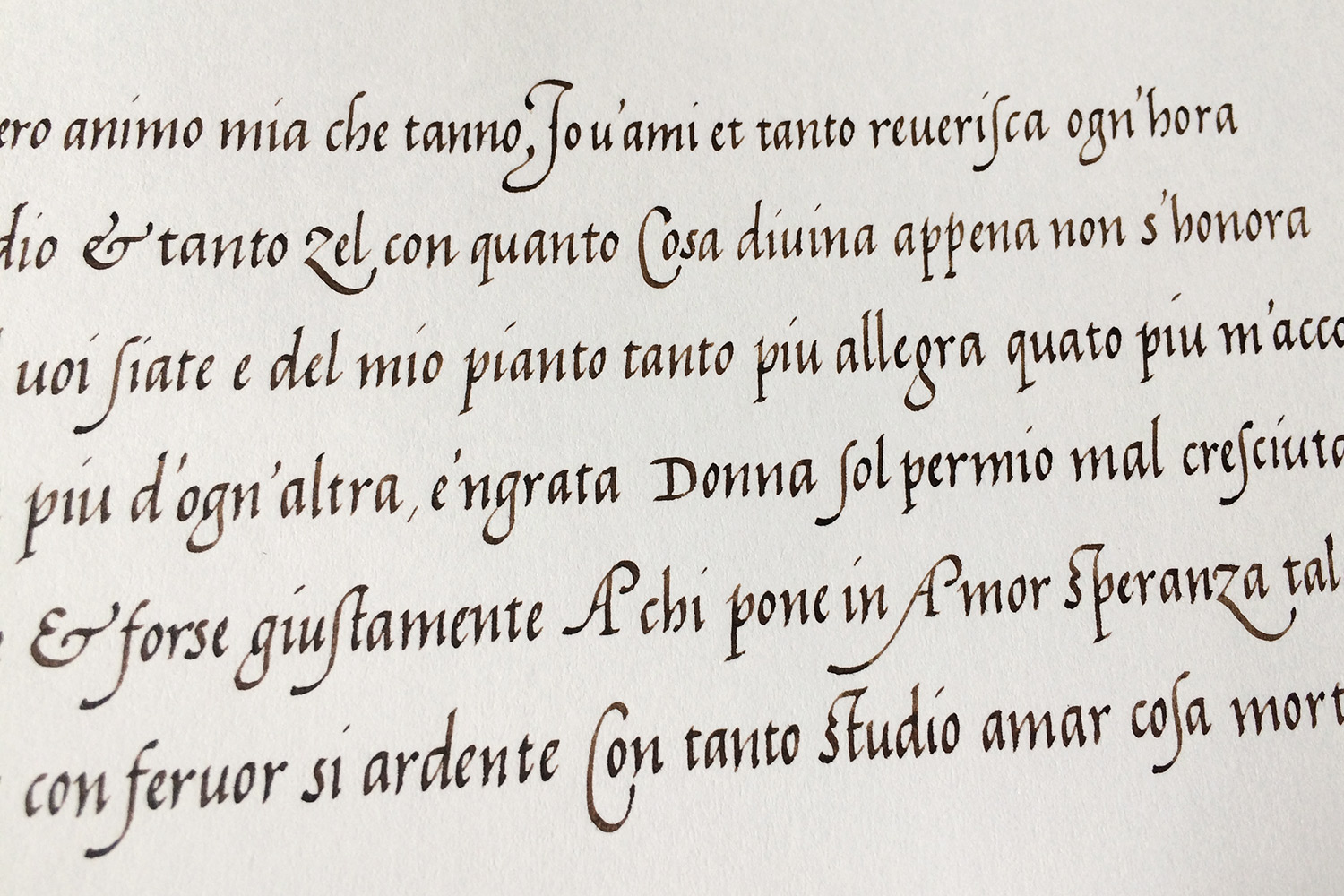
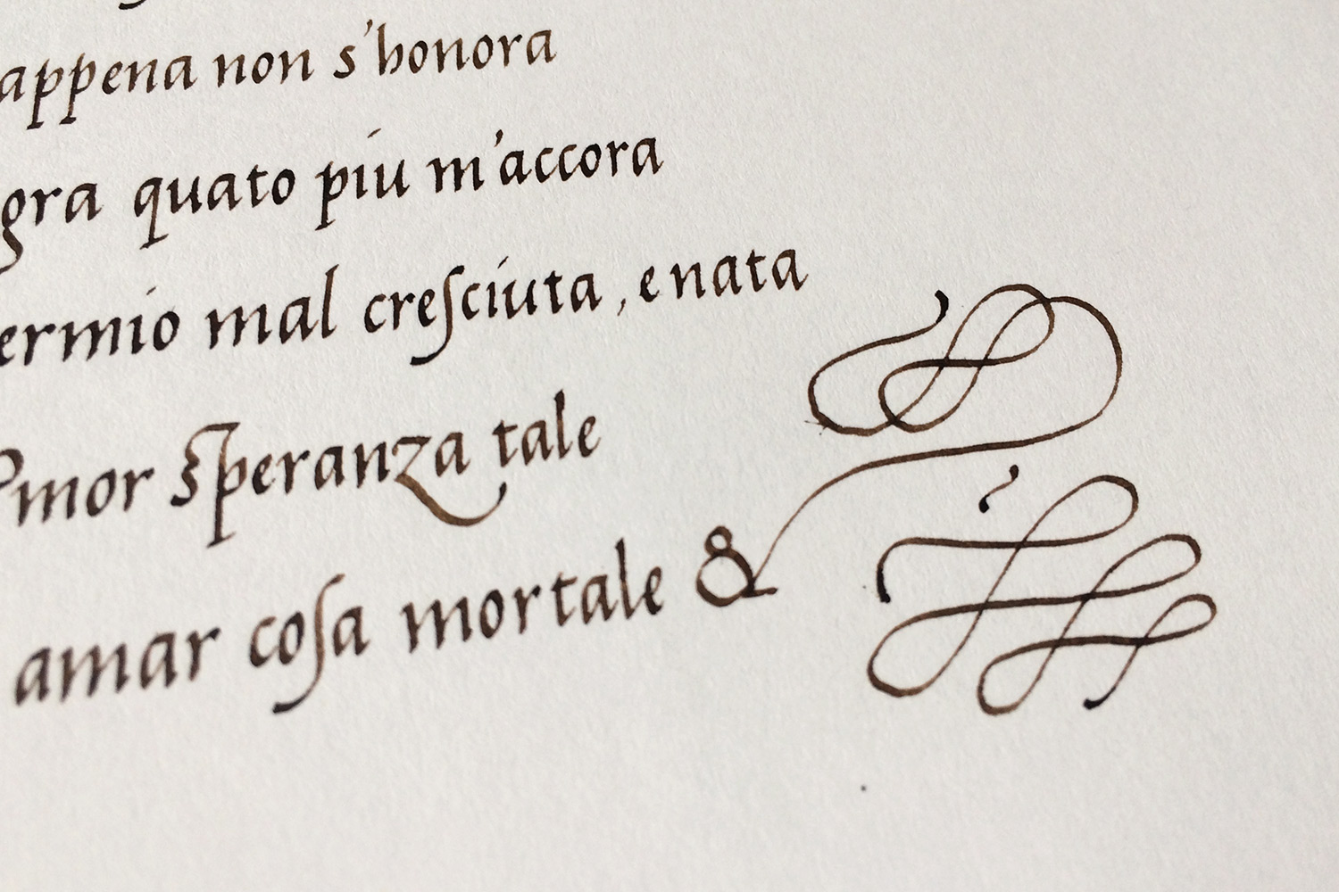
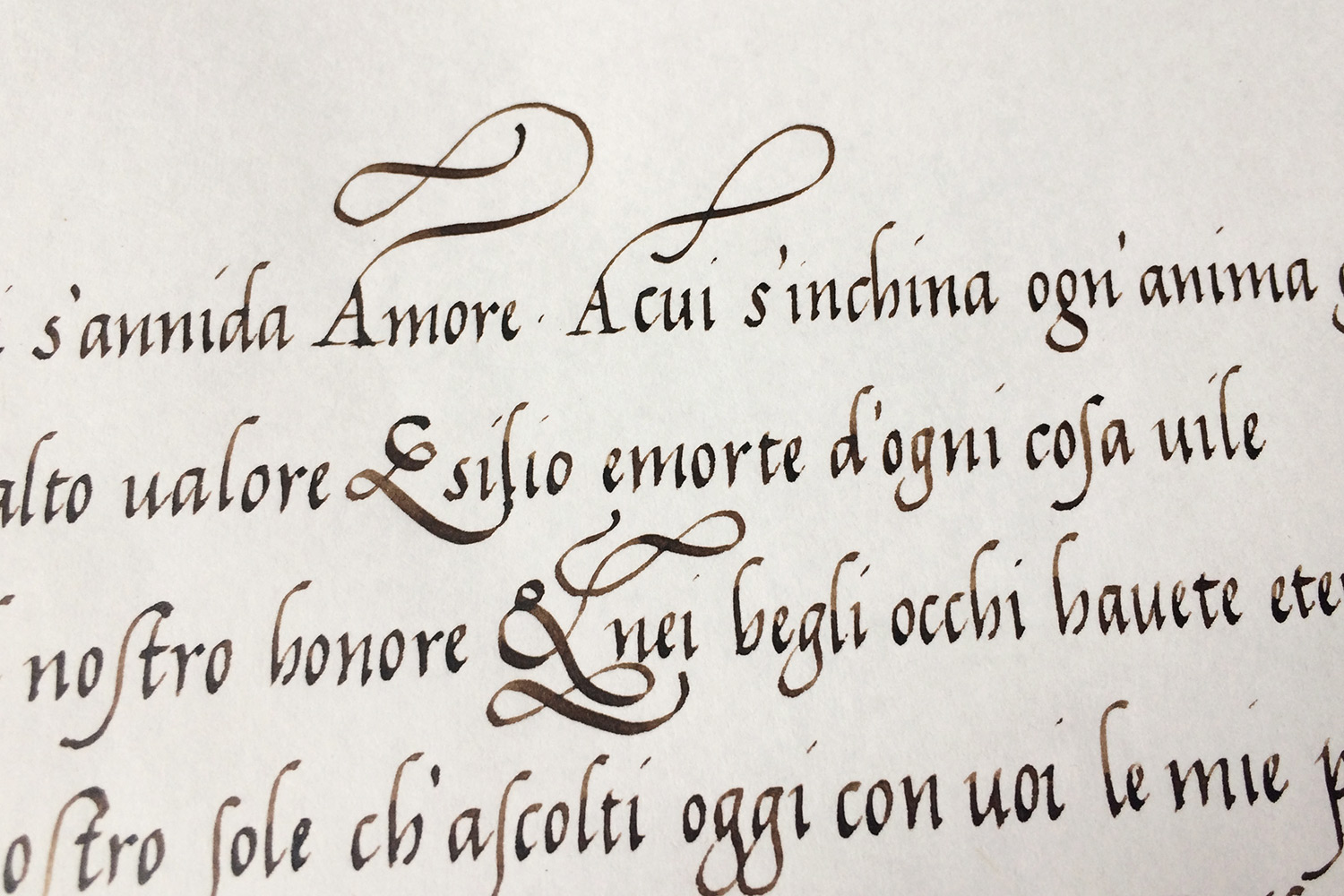
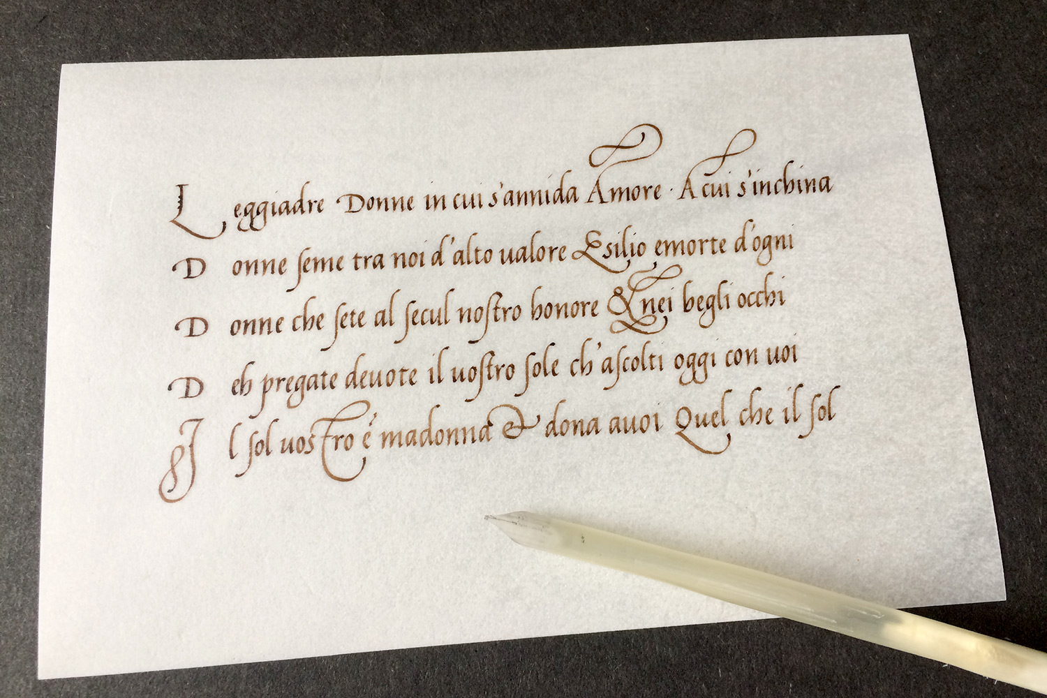
In my studies, I concentrated on his cancellaresca versions. They are quite compressed and somewhat angular, but still delightful and stunning to look at. The difference between cancellaresca corsiva and formata is, that in corsiva most ascenders are “kerned”, meaning they have a little flag to the right, while formata has rather “chopped off” ascenders.
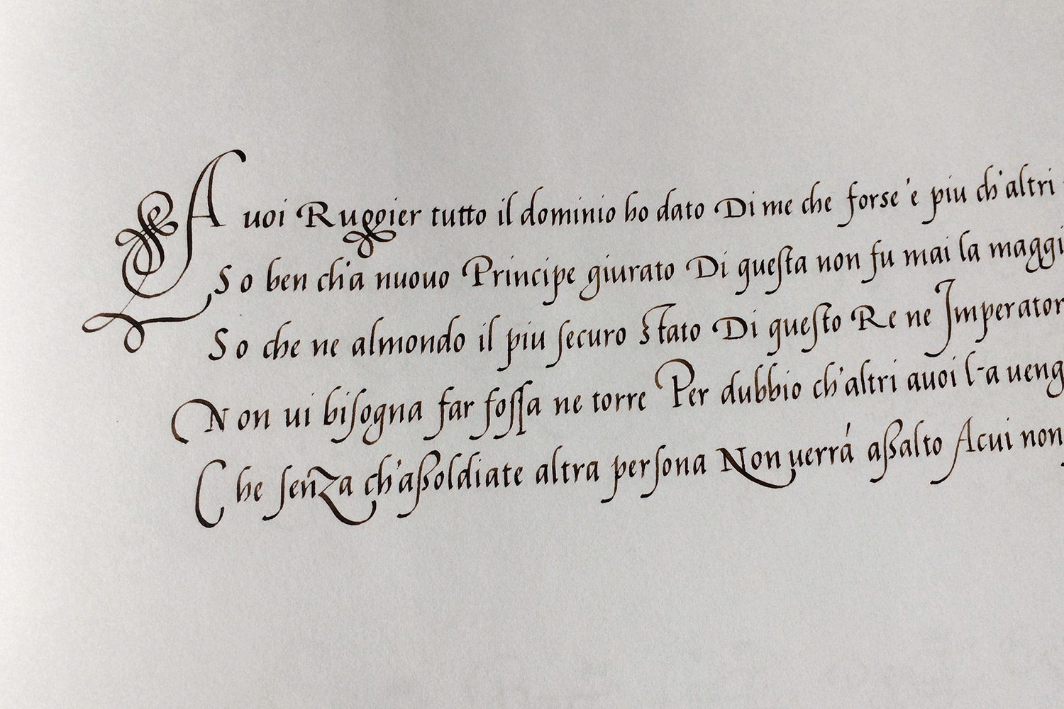
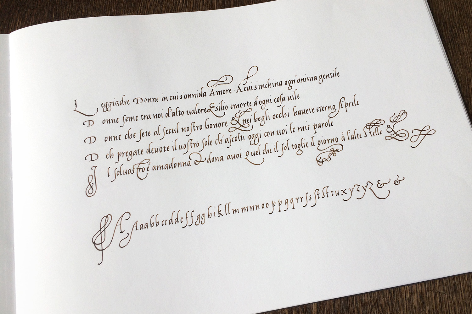
To get familiar with the script, I rewrote all the pages, studying each ligature, every loop and all peculiarities. I wrote in an x-hight of 2.5 mm, which seems still larger than his original. His script is quite condensed, and the n’s play a particular role here: usually the arch would spring from the very base of the letter, but Cataneo moves the pen up on the foregoing stroke and departs only midway. This helps to have a larger counter, giving more white space, which is helpful in a compressed script to avoid dark areas. However, moving up exactly on the foregoing stroke is really difficult – one has to write deliberately slowly to achieve this.
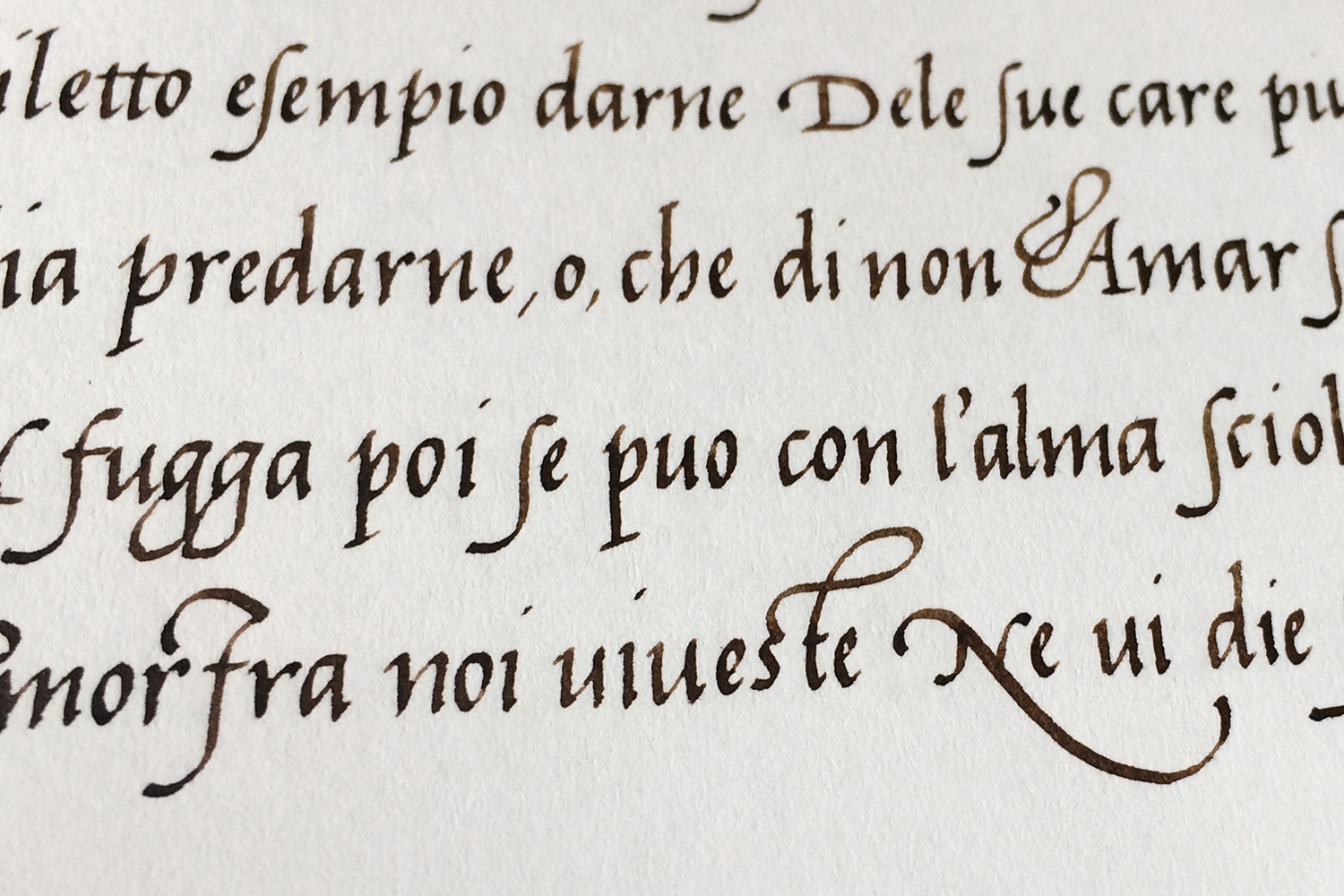
The other big challenge is producing a distinct contrast in the stroke width. My practice paper didn’t allow that, because the surface of the paper is pretty open and the ink spreads slightly. But my final goal was to write on parchment anyway. I ordered sample sheets months ago because I wanted to try to write on the smooth surface everybody (well, everybody who knows about writing matters) is talking about. Cataneo himself wrote on vellum. The book has forty pages, but only twenty contain text. He wrote on the sides with smooth skin only, meaning the flesh side, avoiding the hair side! That’s important to know when one is wondering about the strong contrasts in stroke widths – it’s quite a challenge.
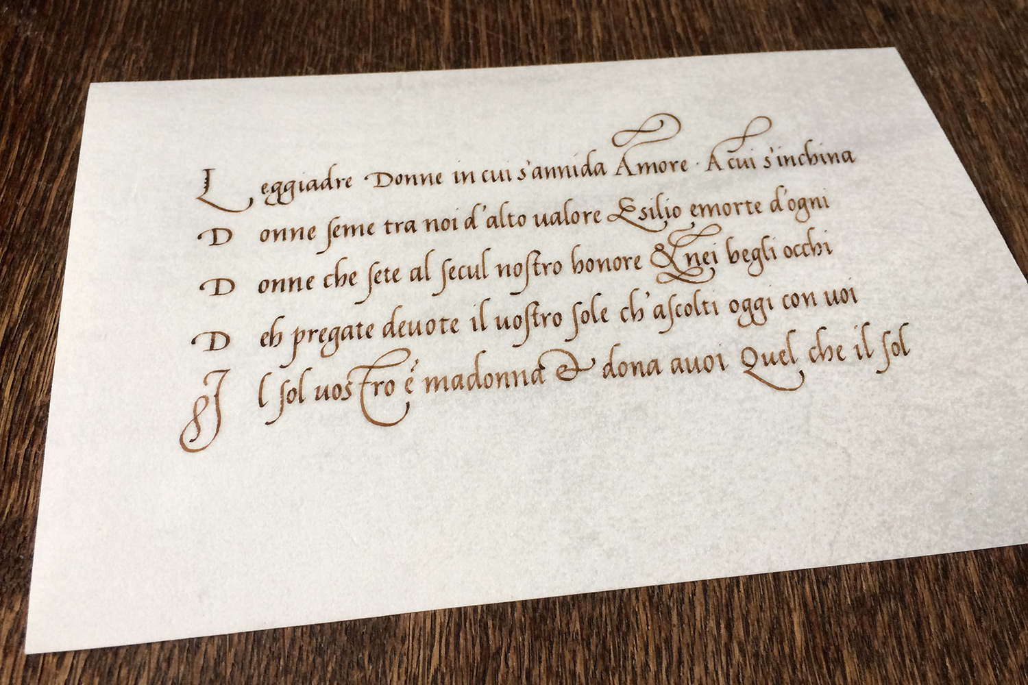
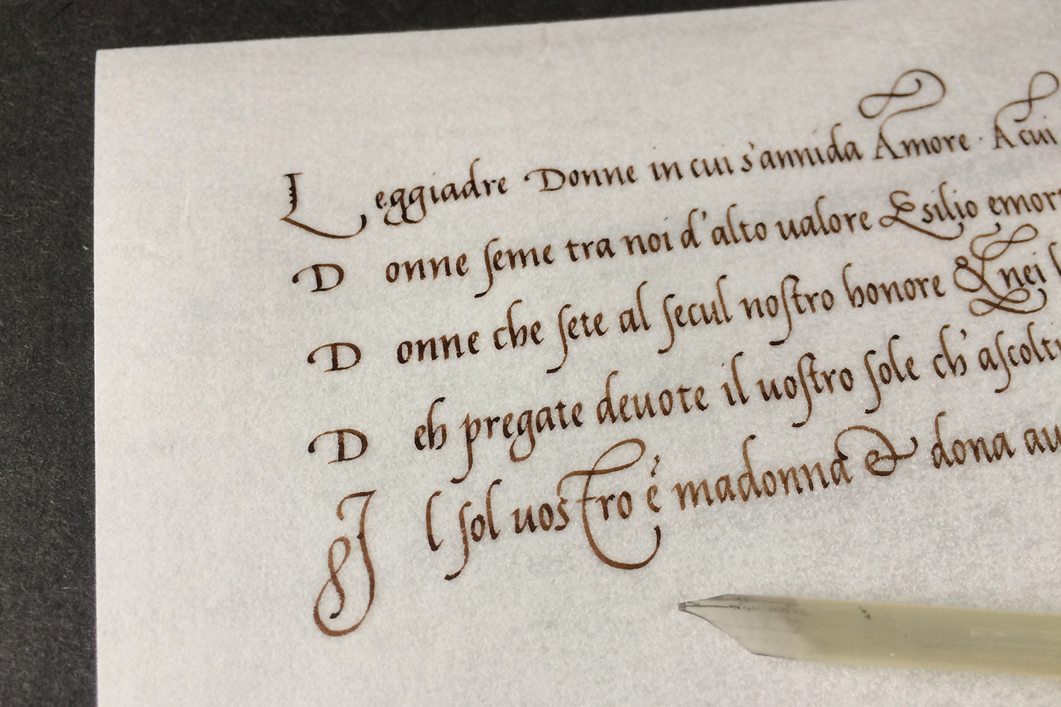
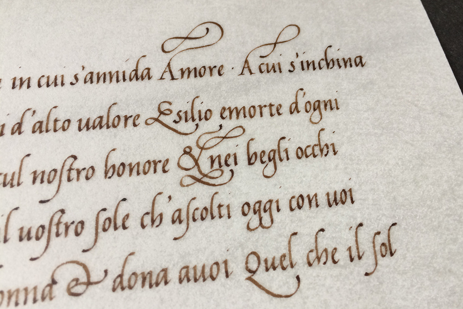
These photos are from my practice booklet, they are my renditions of all twenty of Cataneo’s cancellaresca texts.

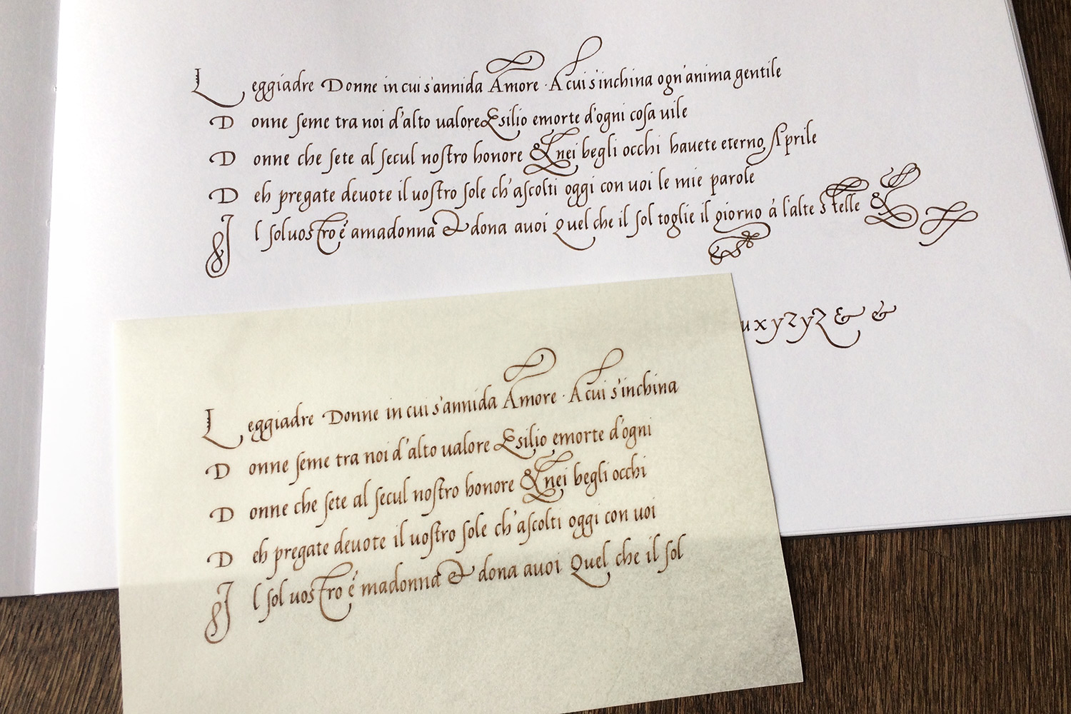


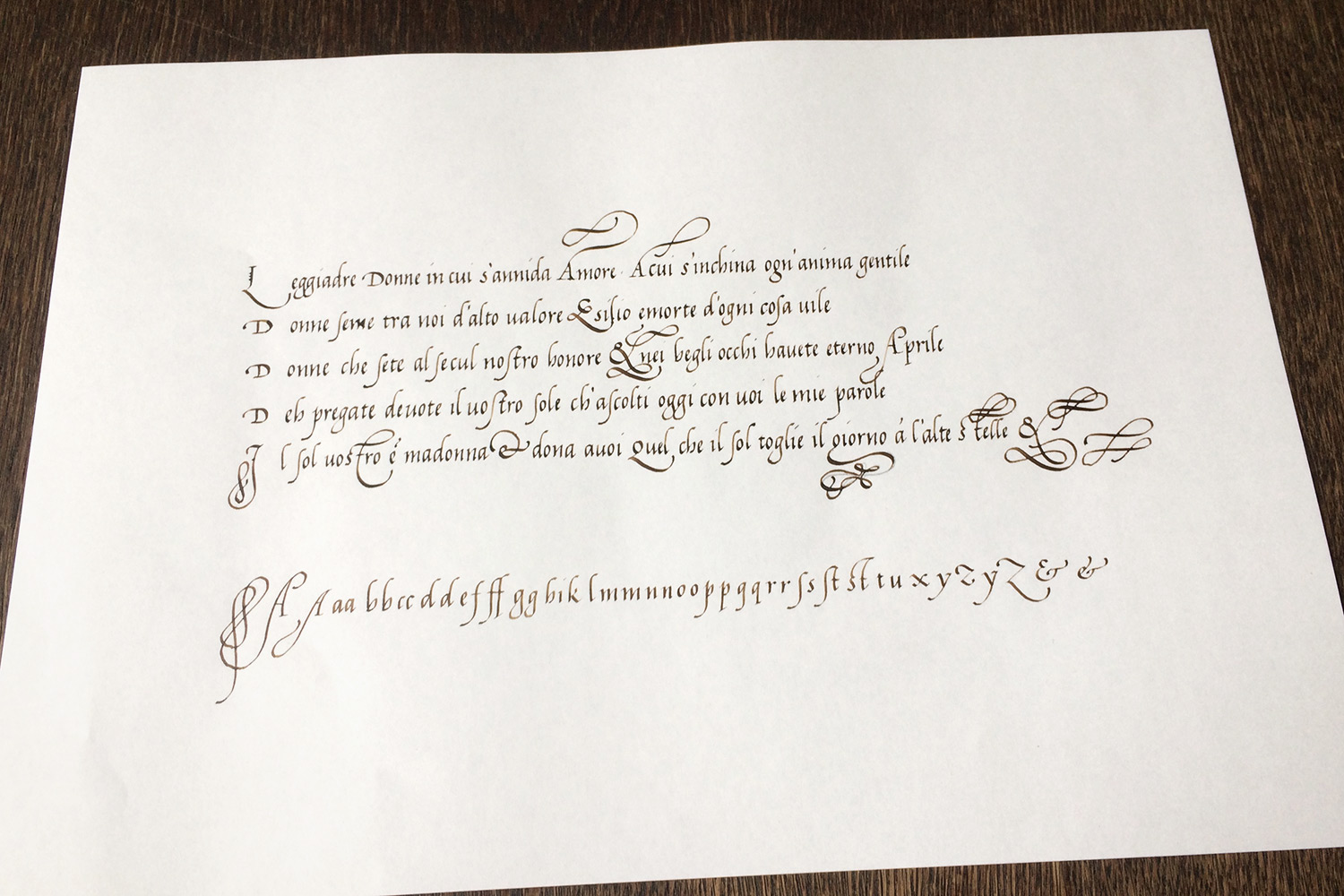
This is just a single-page sample to compare, written on Rhodia paper. You can already notice a difference in how the ink sits on the writing surface.

And the last photos are of my rendition on the parchment piece, or to be precise, calf vellum*, which I ordered from England. It was written with walnut ink and goose quills. Unfortunately the vellum sample is only 15 cm wide, so I couldn’t fit the full line lengths.

* The term parchment is a general term for any animal skin, whereas vellum refers to parchment made from calf skin.