Depending on which source you consult, you can find different definitions of fraktur. I enjoy reading the older documents from the people who actually used it on a daily basis. And they didn’t talk (in their books) so much about theory, they simply demonstrated it. They provided samples of written script, some even chopped the letters apart and gave step-by-step advice on how to build them up.
By “they” I mean the writing masters from the 16th century. For example there is Neudörffer the Elder, one of the earliest known writing a fraktur. In his manual Gute Ordnung from 1538, he includes illustrations of an m which explains the build-up of the script. I’ve included (fig. 1) a shorter version of the process for those who are unfamiliar. One doesn’t lift the pen in-between, rather moving upwards on the surface of the paper, continuing the stroke throughout until the letter is complete. The two example letters I picked are a and m, where you can see this clearly.

Fig 1: Illustration showing the ductus of Neudörffer the Elder
According to Gerrit Noordzij (The stroke, theory of writing), this is a typical running construction.
I love to look at Neudörffer’s fraktur, however, there is a detail that I dislike: the stems of some of the letters tend to get thicker in actual execution. For example when one writes the n or m, the 1st (and 2nd) stroke might look swollen if you don’t precisely follow the path of the downstroke. When you move upwards with the full width of your nib, writing at a certain speed (which a running construction is intended for), this can happen quite fast! Even in Neudörffer’s script that happened, as you can see on the last two letters in the following depiction. Stems on the left are thicker than the ones on the right. The same phenomenon can be observed with the right stem of the a.

Fig 2: The stems of letters tend to get wider; right: original letters of Neudörffer the Elder
As a second relevant example of writing a fraktur, I would like to mention Leonard Wagner, who wrote the Clipalicana major in his book of one hundred script examples for Maximilian I in 1513. His fraktur is very interesting to study because it is also a very early one, considered to be a basis for many to follow. While examining and re-writing his text, I got familiar with the individual letter shapes, comparing them to the ones from Neudörffer. I really enjoyed his unagitated treatment of the letters as a sequence, but even here some of the letters bothered me. Especially the a – it’s written with three individual strokes, leaving a little corner in the inner top right. The running construction of the letter m is similar to Neudörffer’s ductus.

Fig 3: Illustration showing the ductus of Leonard Wagner
For my current research project, I got to know the fraktur of Roßberg quite well, who published his theories much later, in 1793. His approach is super-systematic, using math to justify the shapes. His version of fraktur for headlines is meant to be constructed and filled in with patterns. Roßberg also defines a written fraktur, also based on the initial construction, so it still looks quite artificial. For comparison, I will show our by-now established example letters, introducing his approach.

Fig 4: Illustration showing the ductus of C. G. Roßberg
Please note that there are about 250 years between the early shapes of Neudörffer and the mannered letters of Roßberg.
While studying these different scripts, similarities and differences revealed themselves naturally. Some details I enjoyed, while I struggled with others. Eventually I decided to develop my very own version which I wanted to define and cultivate, combining favourite letters from the writing masters with my own shapes. After all, my portal’s name is Manufraktur (btw the script for the logo is based on Baurenfeind).
So here we go, first the demonstration of the letters and finally a written example of a longer text.

Fig 5: Illustration showing my fraktur composition
In principle, for the a, I took the approach from Neudörffer; only when moving upwards, I lift the right corner of the quill to draw only with the left; the result is a fine line instead of the full-width stroke. In my opinion it looks more elegant, and it also prevents an accidentally too-wide double stroke. Anyway, it really feels good to write the a with that ductus. For the m and similar letters I dropped the running construction and decided to lift my pen, simply because of aesthetic reasons: I prefer that all my strokes have a similar width.


Practice sheets
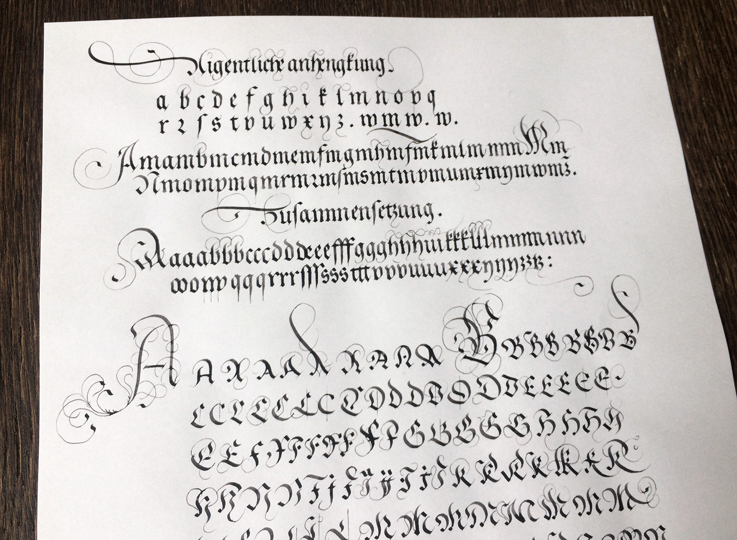
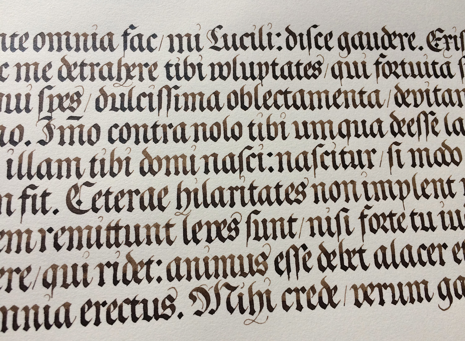
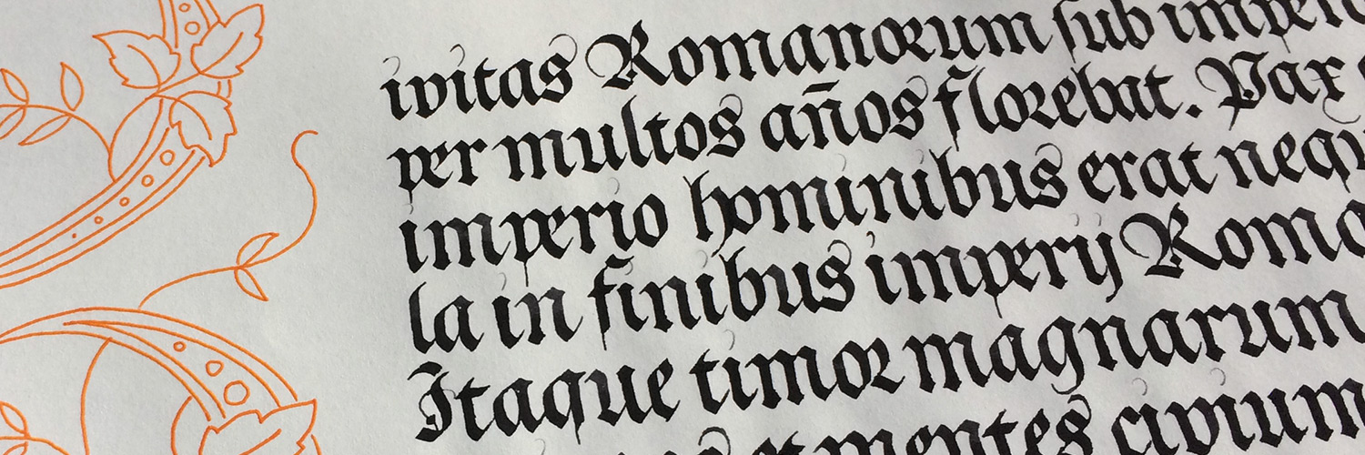
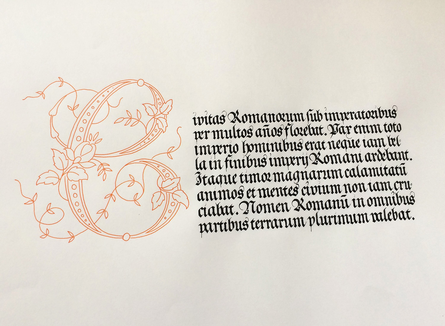
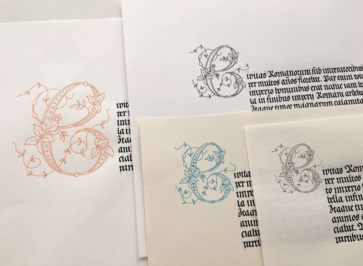
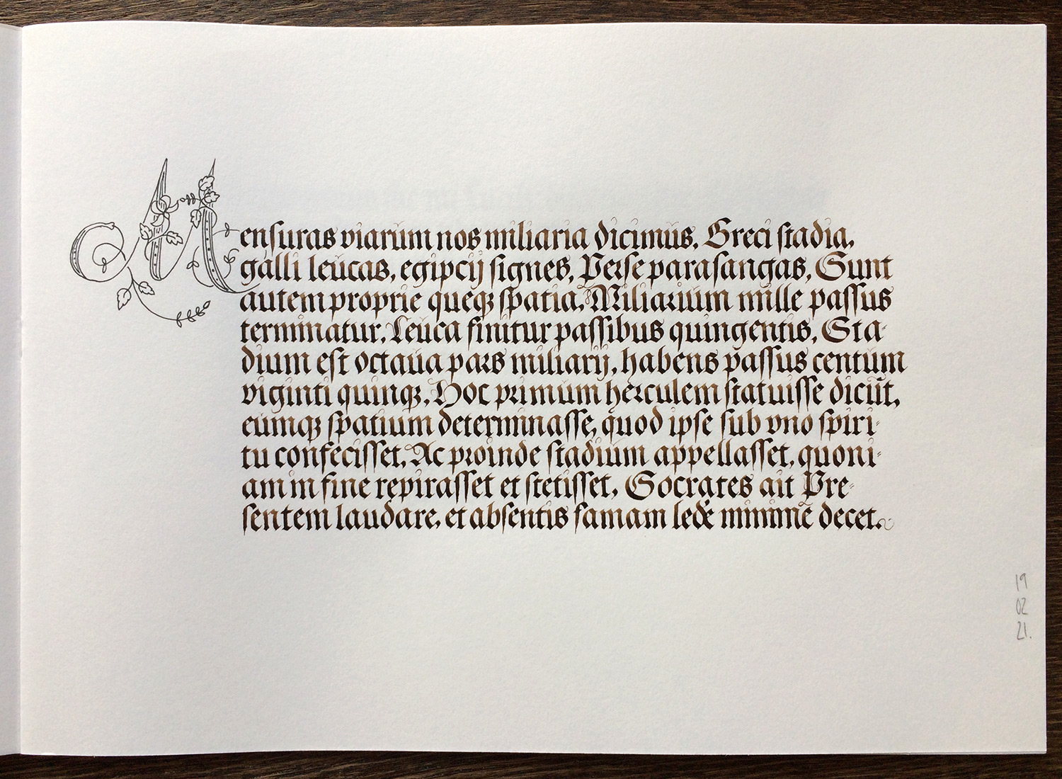
Some selected practice sheets, starting with a text from J. Neudörffer the Elder from his book Gute Ordnung, 1538.
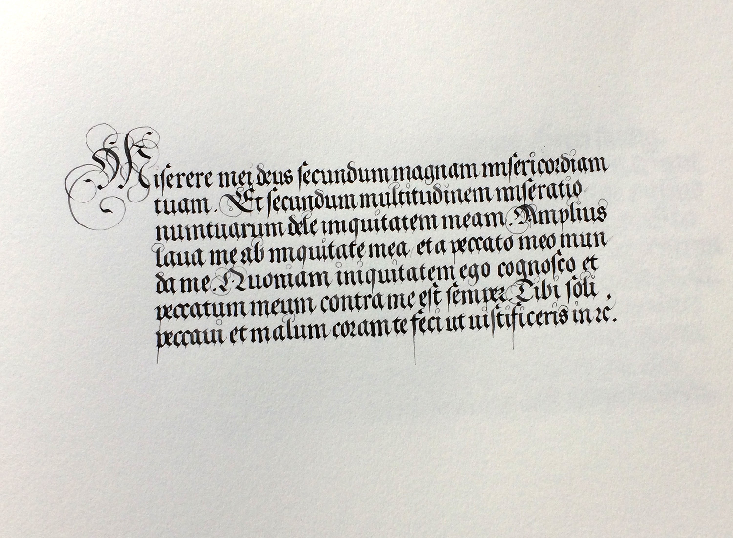
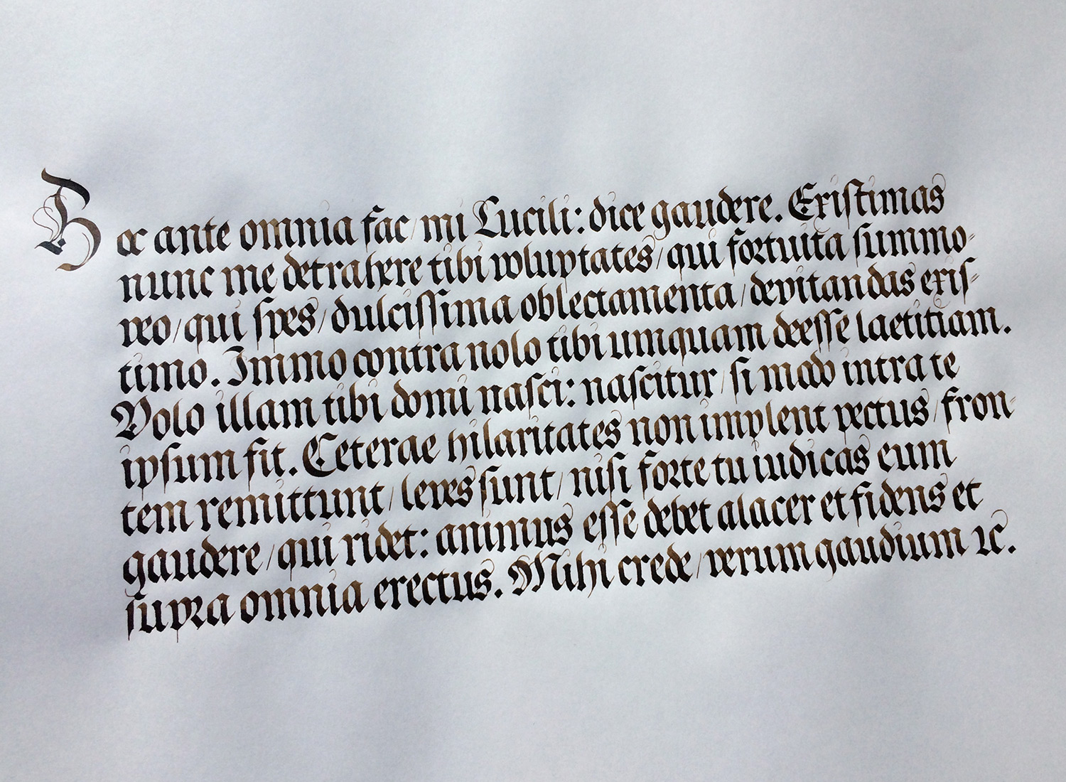
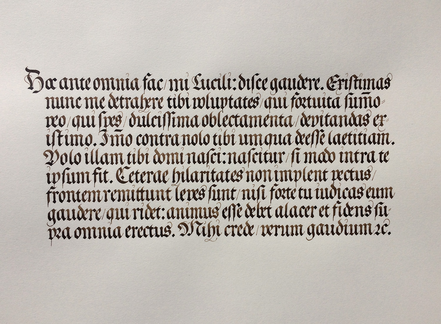
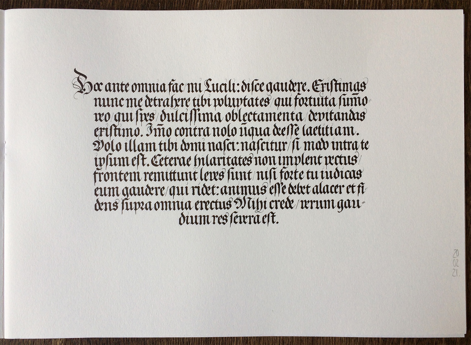
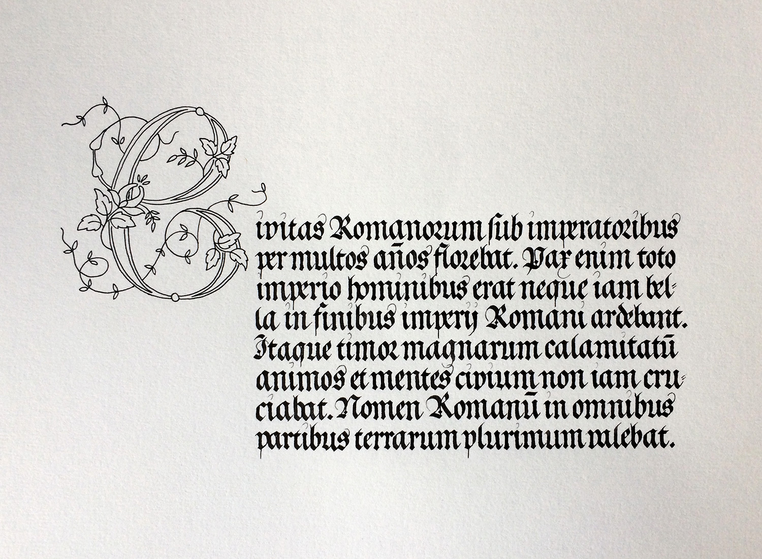
This is the (final) piece I did to practice the style of Leonard Wagner. It’s his early fraktur Clipalicana major which I mentioned above.

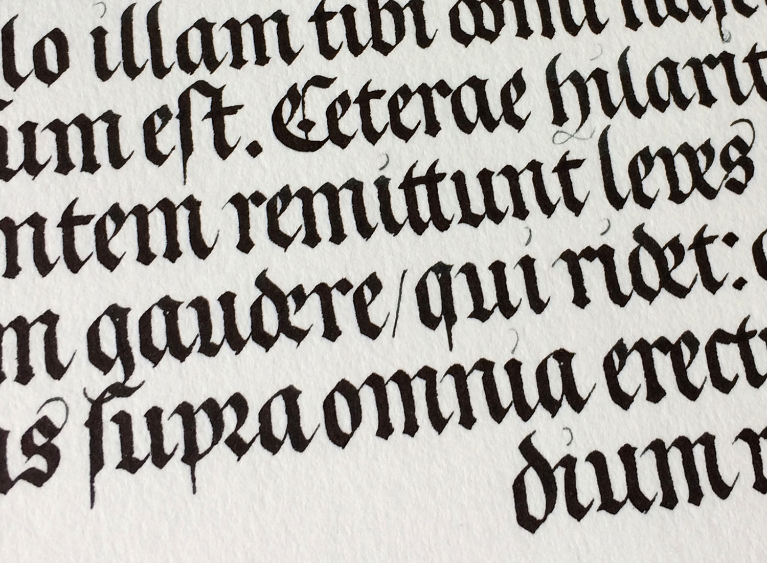
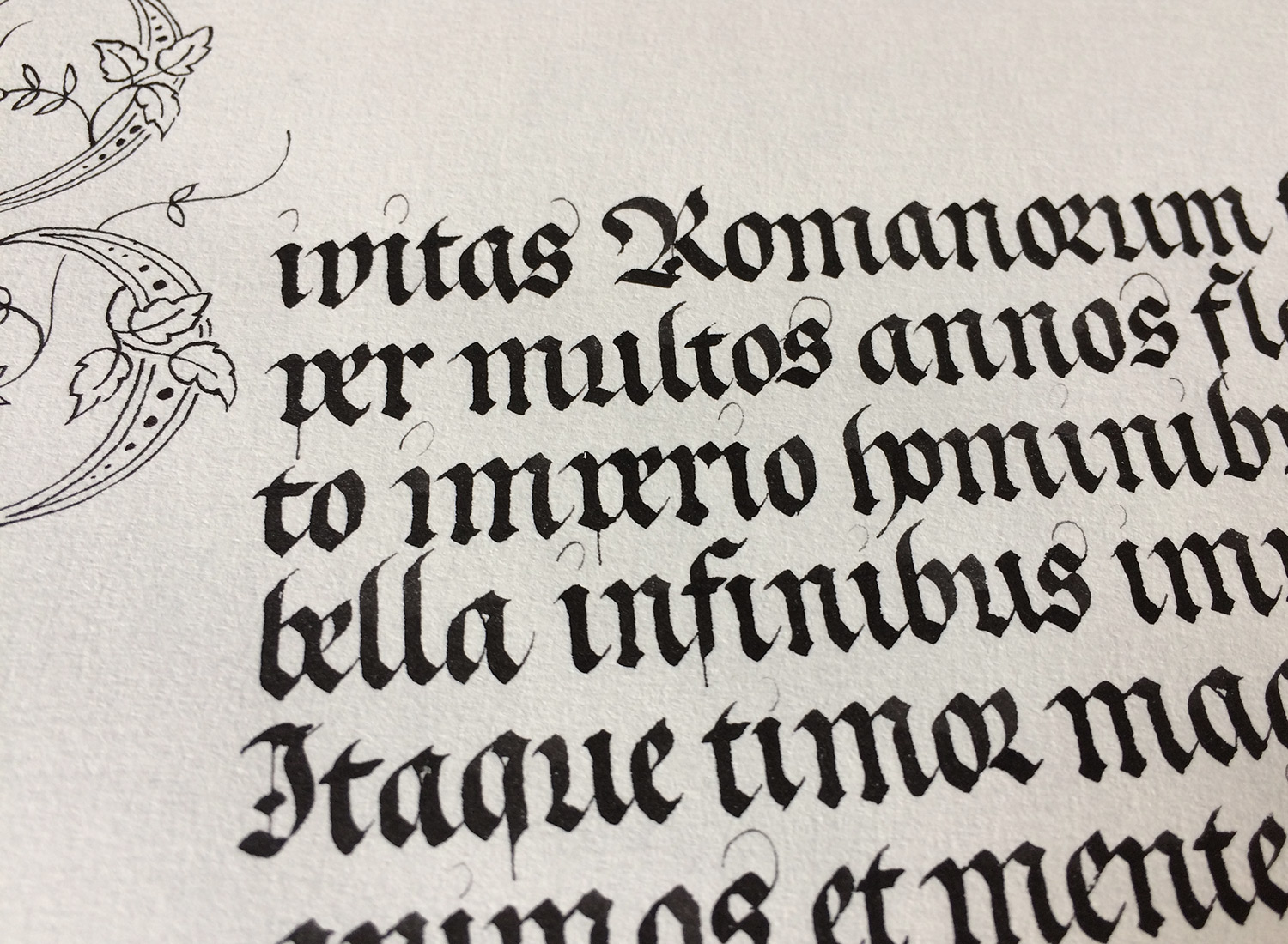
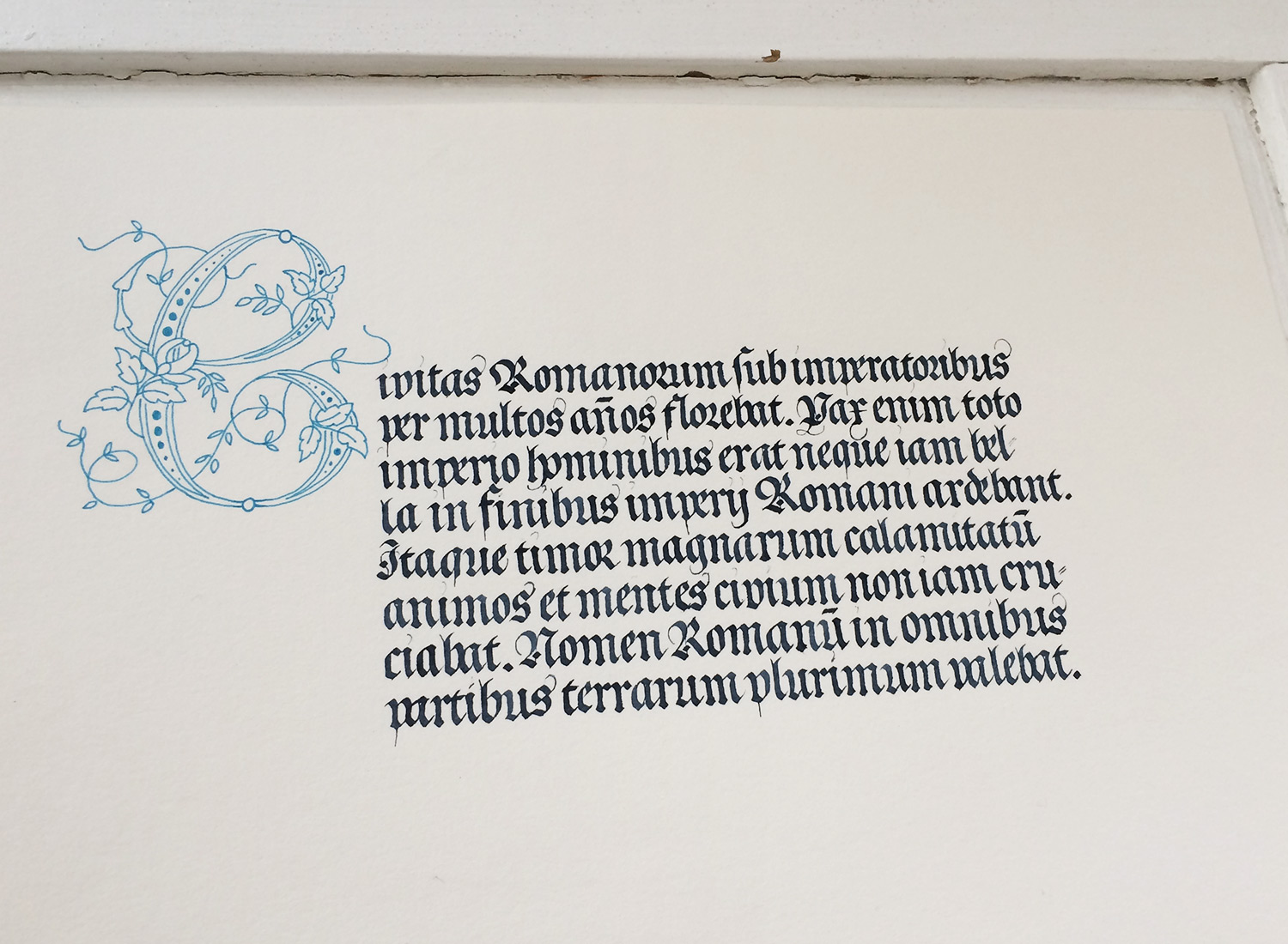
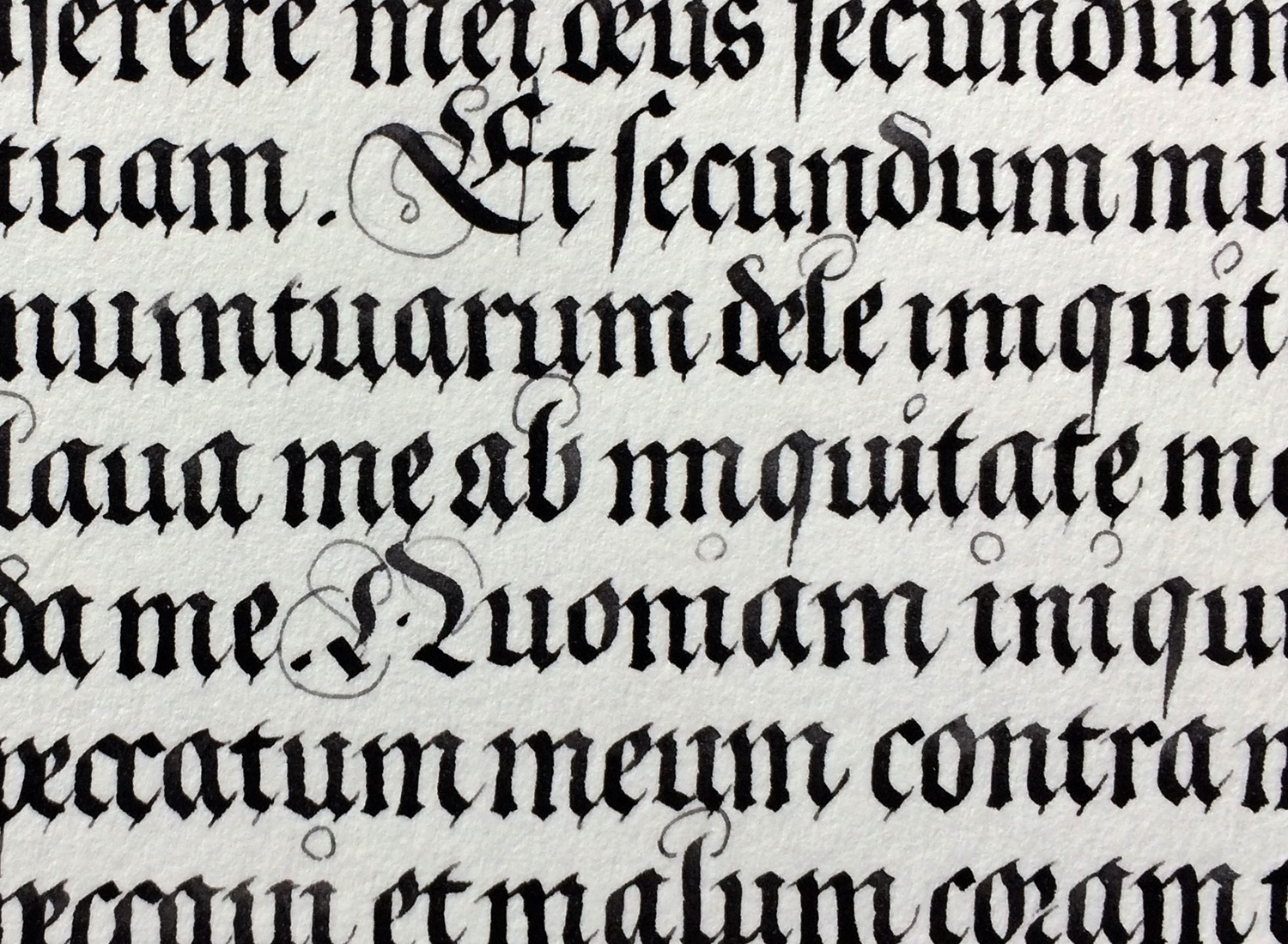
These last shots are random practice sheets, all done while cultivating my own style of fraktur.