– a contrast-heavy display font with strong character
July 2024
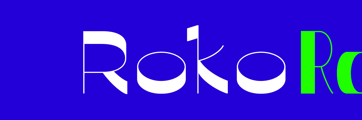
Roko has compelling visual qualities which shine for headline use or in a branding environment.
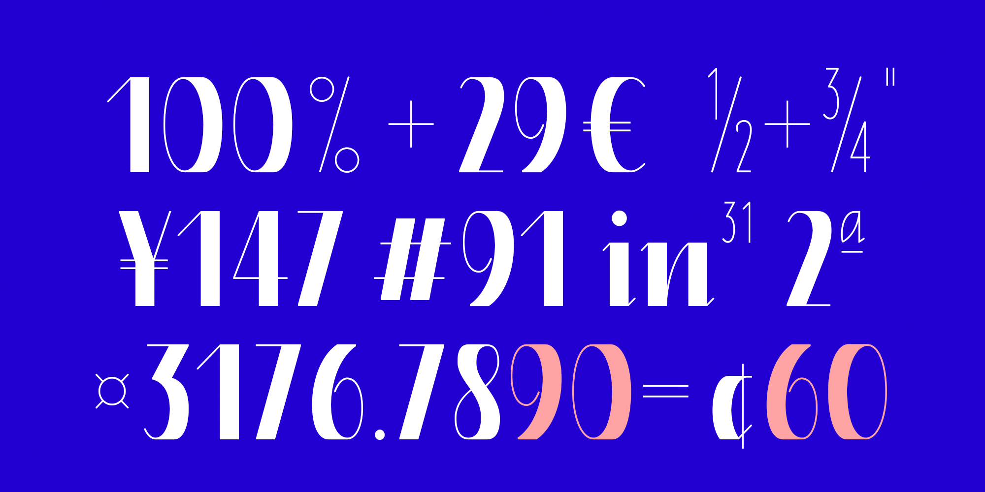
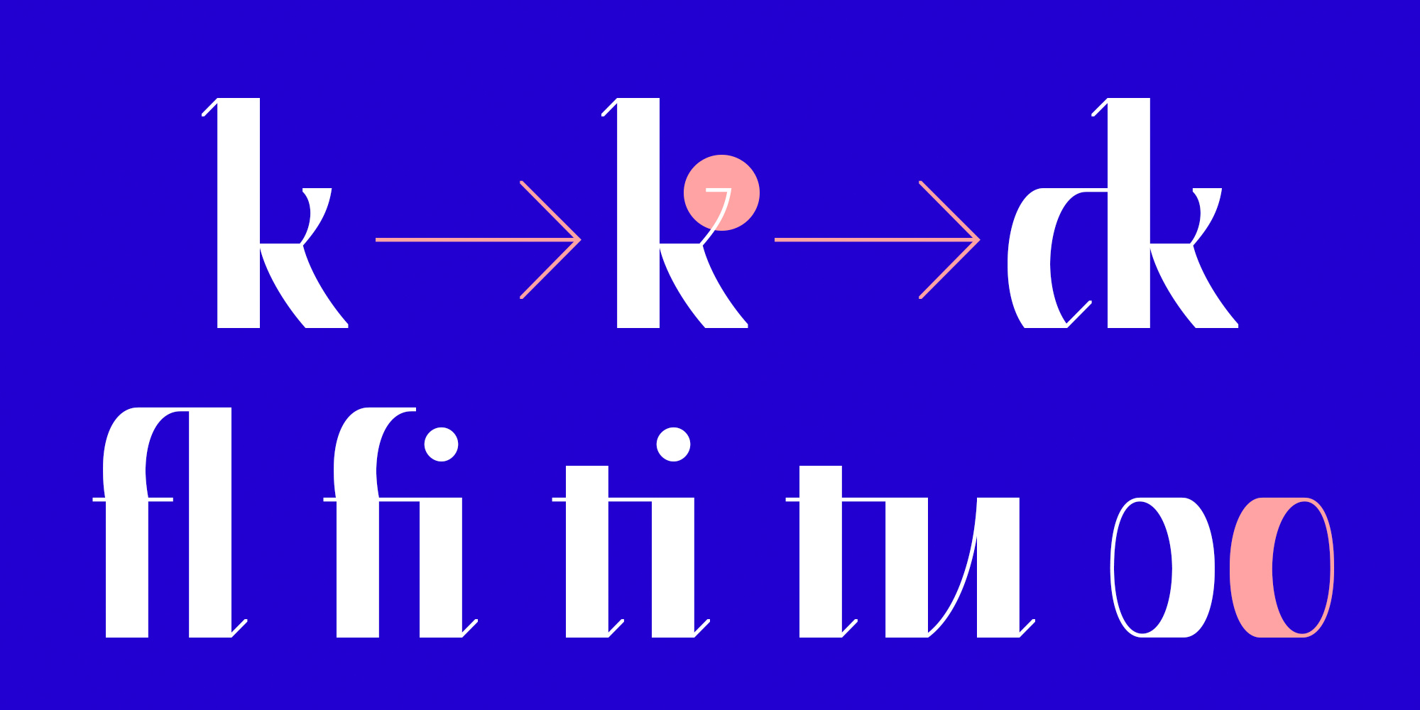
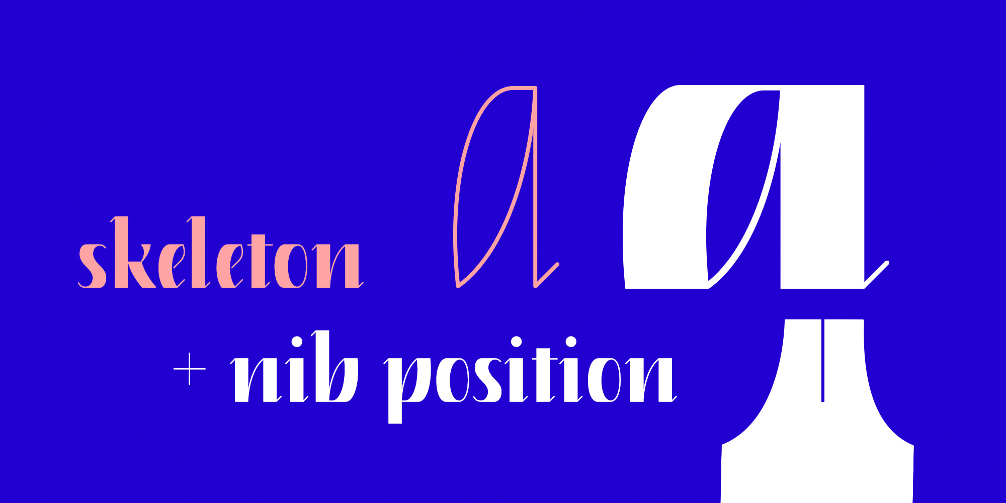
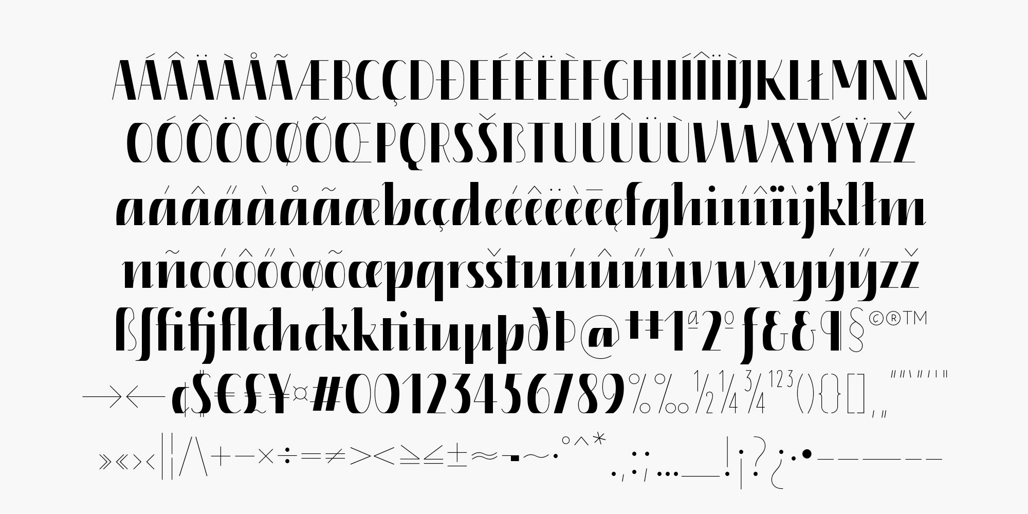
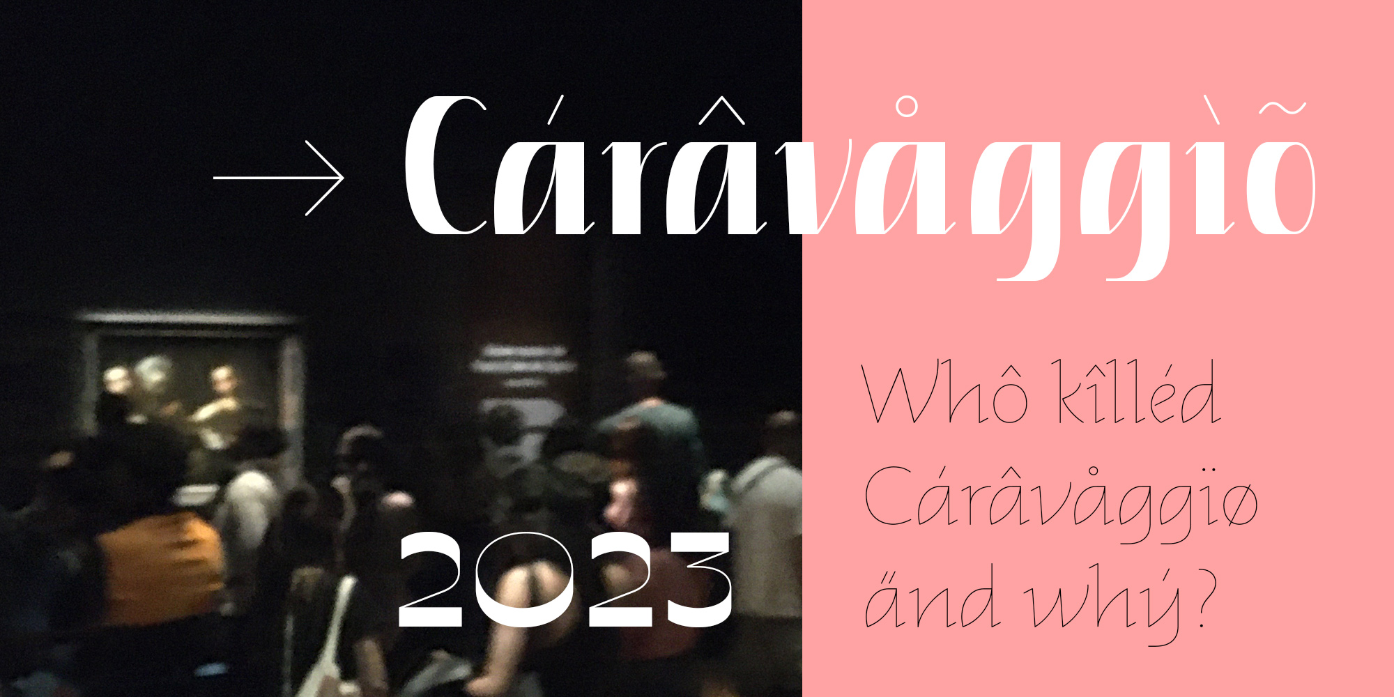
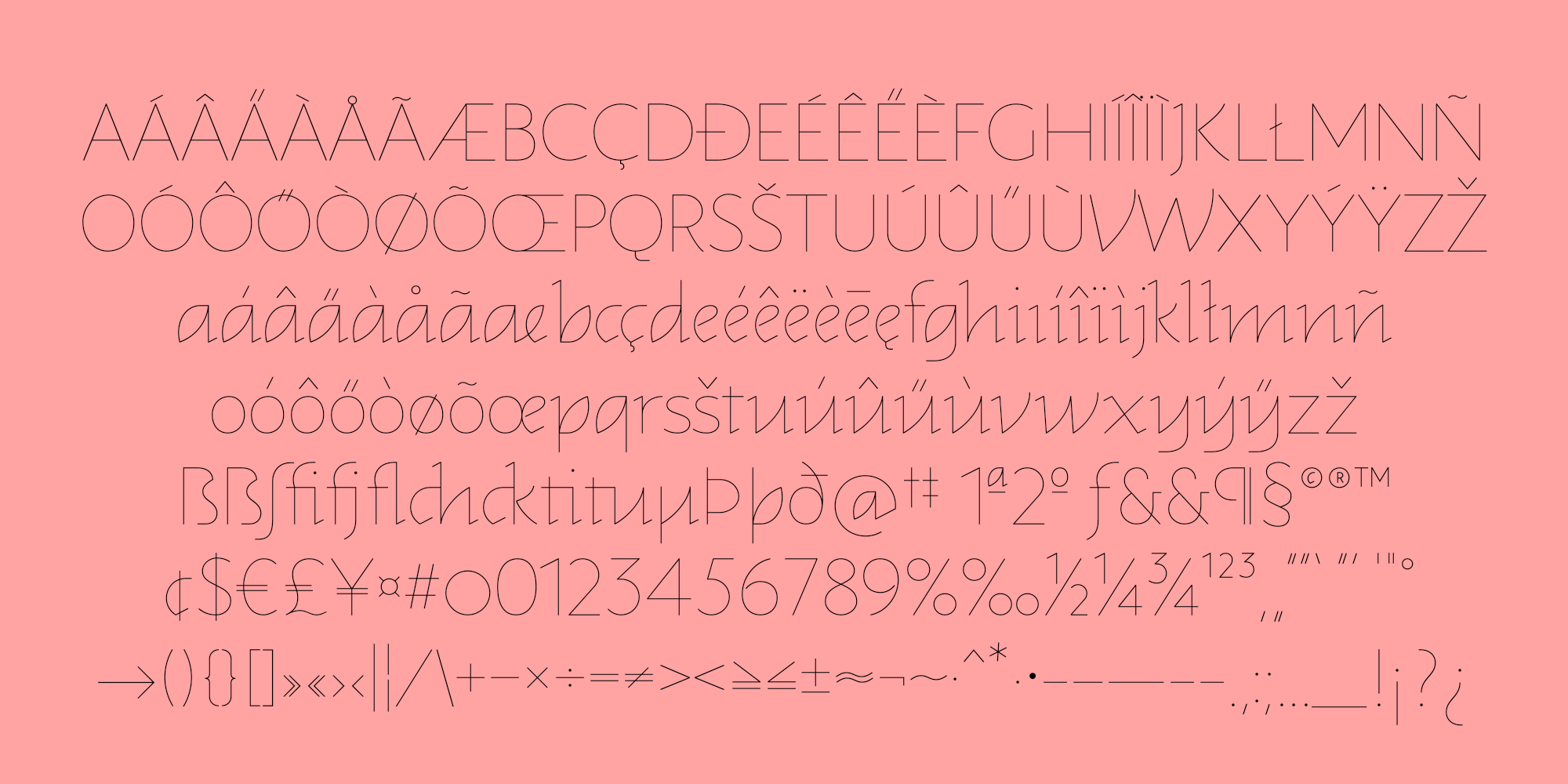
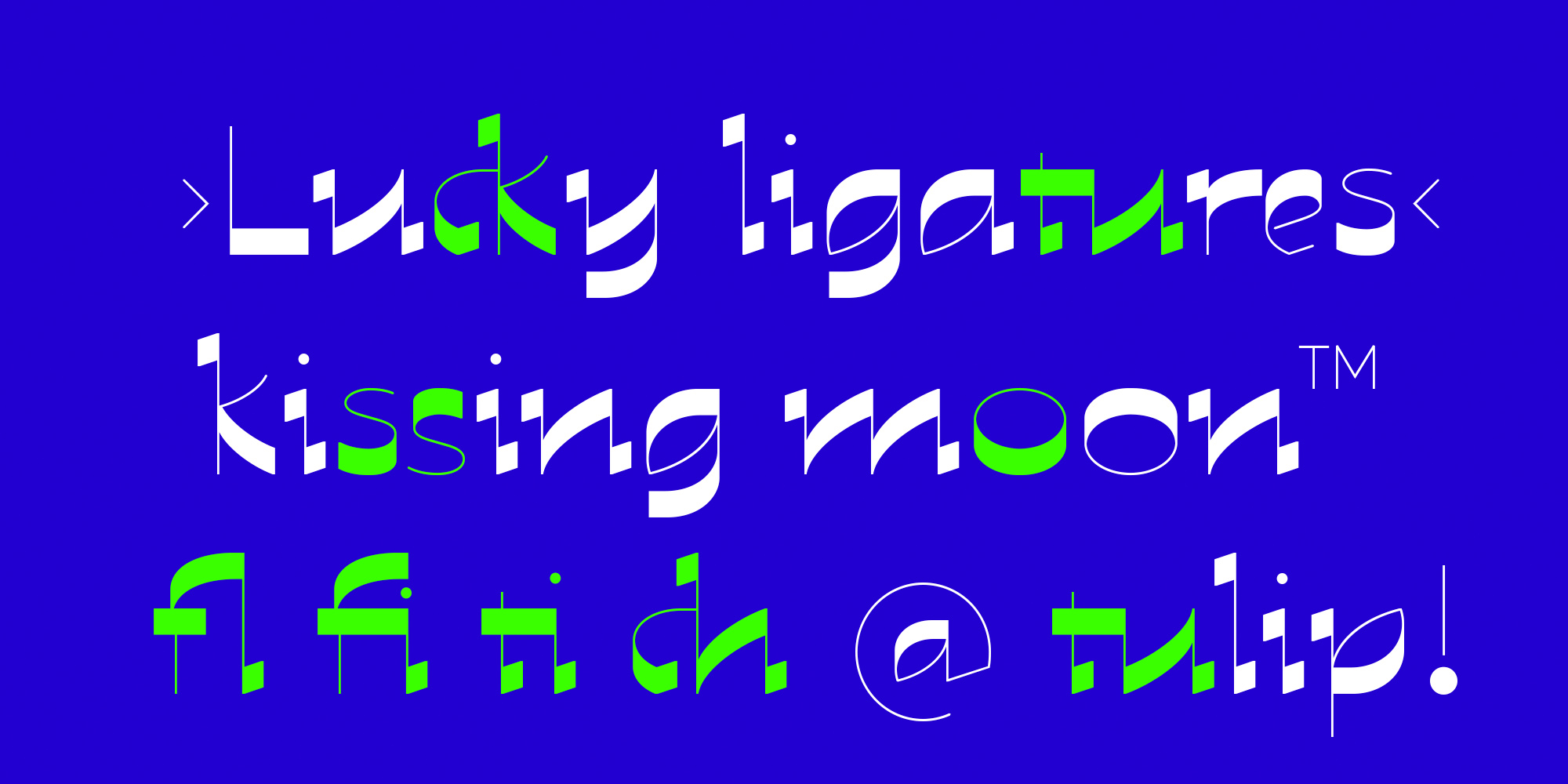
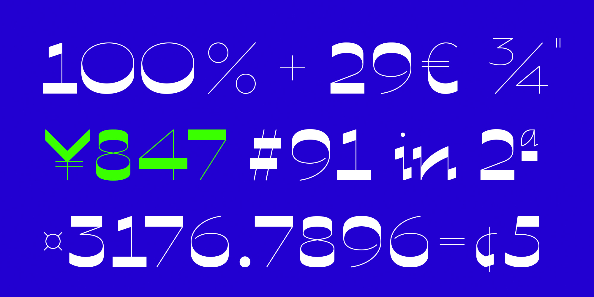
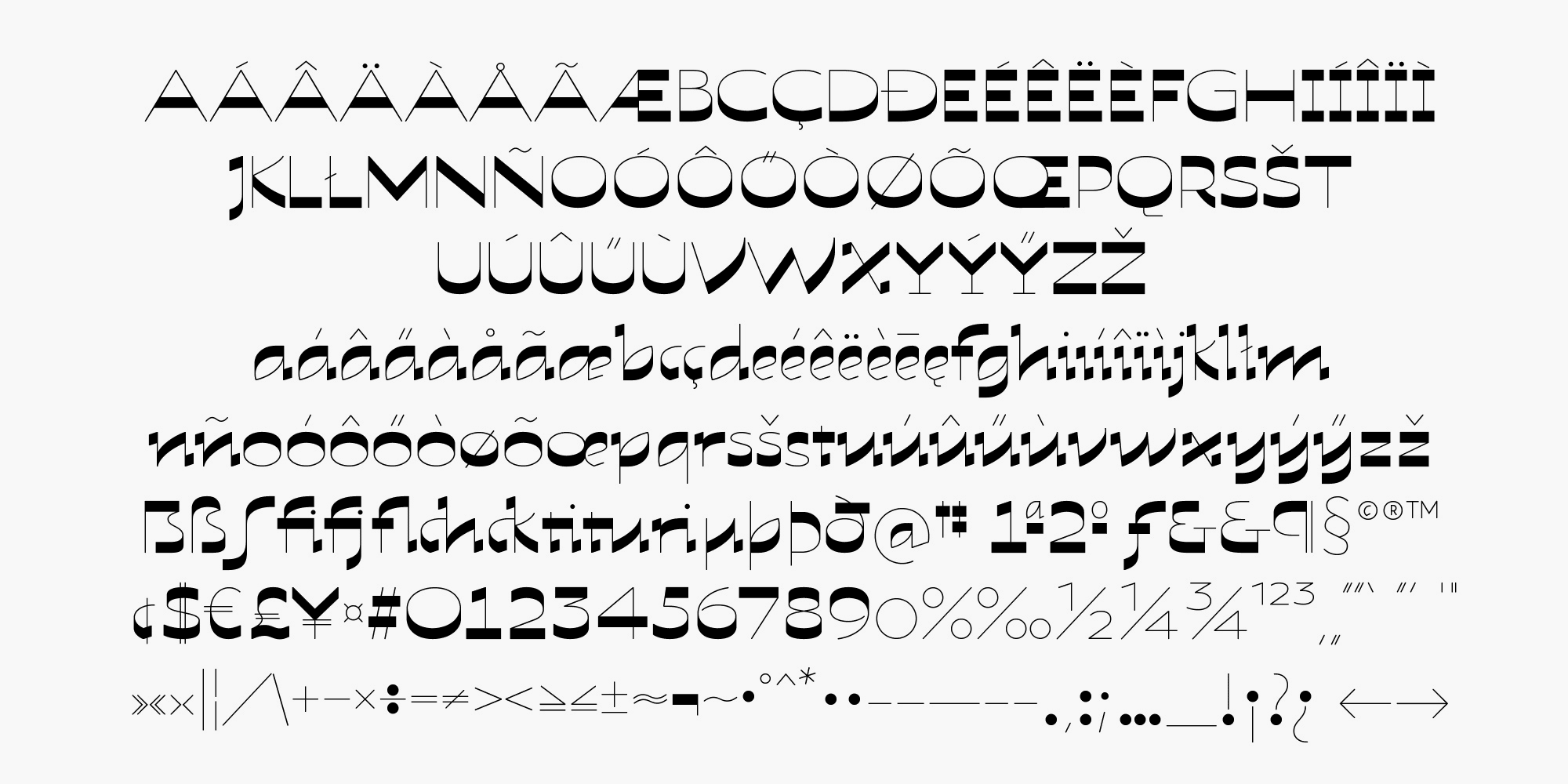
It will grab attention with its high contrast, present in all glyphs. Roko is designed with a rigid mathematical foundation, inspired by an 18th-century writing master. A virtual calligraphy nib is used in full width or moving on the corner, leaving only a thin, delicate stroke. The three styles of the family share the same concept for their skeletons, allowing them to blend well when used together. Roko comes as a Latin-1 character set, covering all Western European languages. It has a variety of alternates and ligatures for you to have fun and play with for interesting combinations.
Roko block

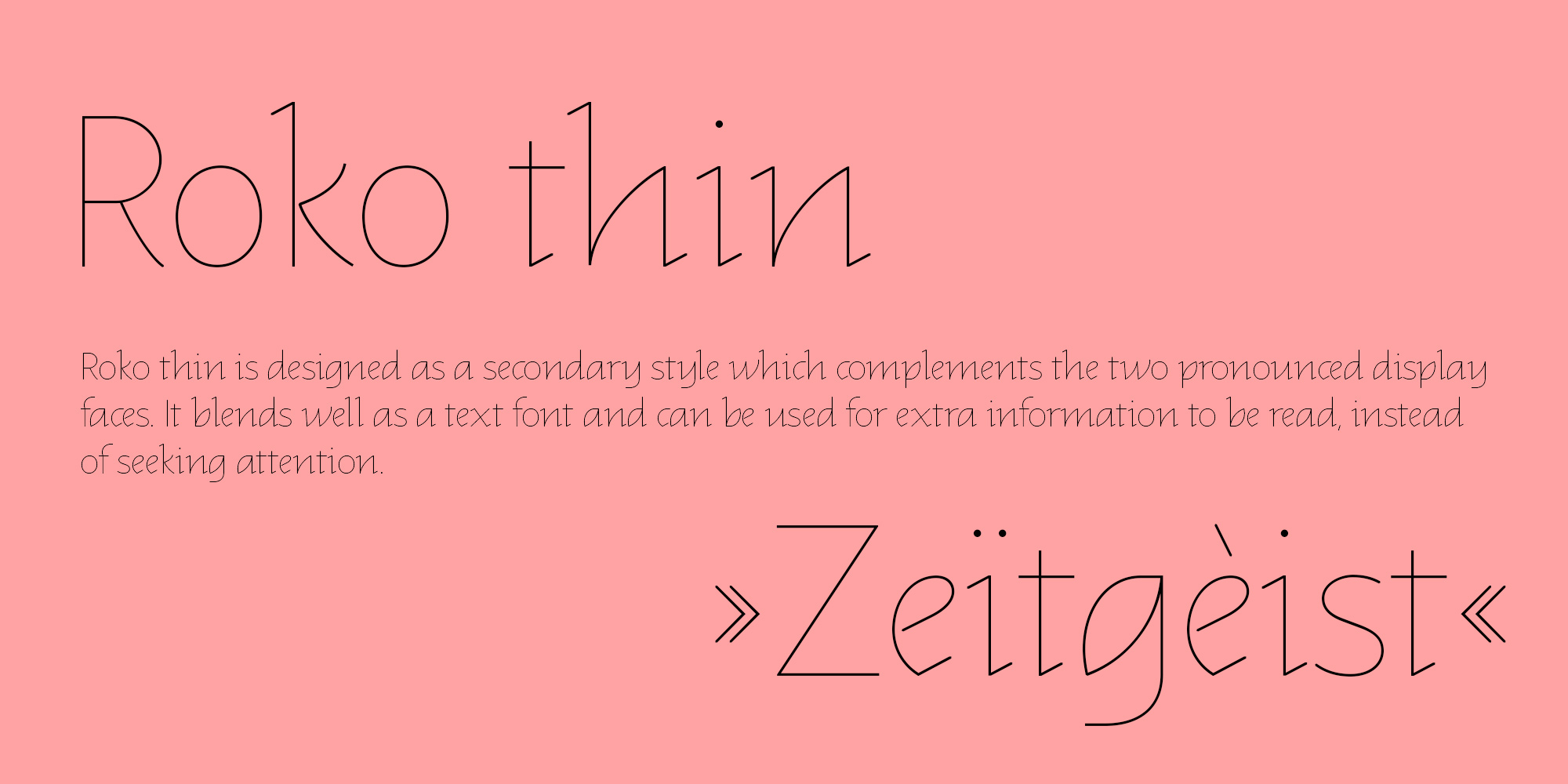
Roko thin
Roko revers

Background and concept
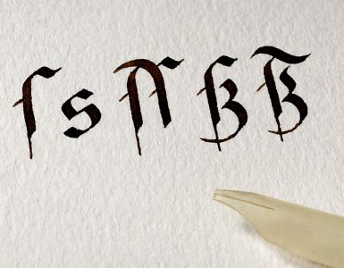
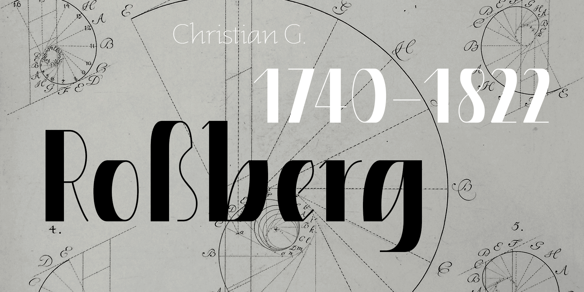
Roko’s design was inspired by the work of 18th-century master calligrapher Christian Gottlob Roßberg. While studying type design at Academy of Fine Arts in Leipzig with professor Fred Smeijers, I programmed Roßberg’s family of blackletter styles utilizing Python and Robofont. Working on the project, I got curious about using Roßberg’smathematical foundation to see how his ideas could look in our contemporary environment. Roko’s name is derived from Roßberg + kontemporär (contemporary).
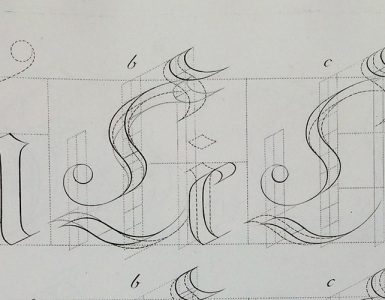
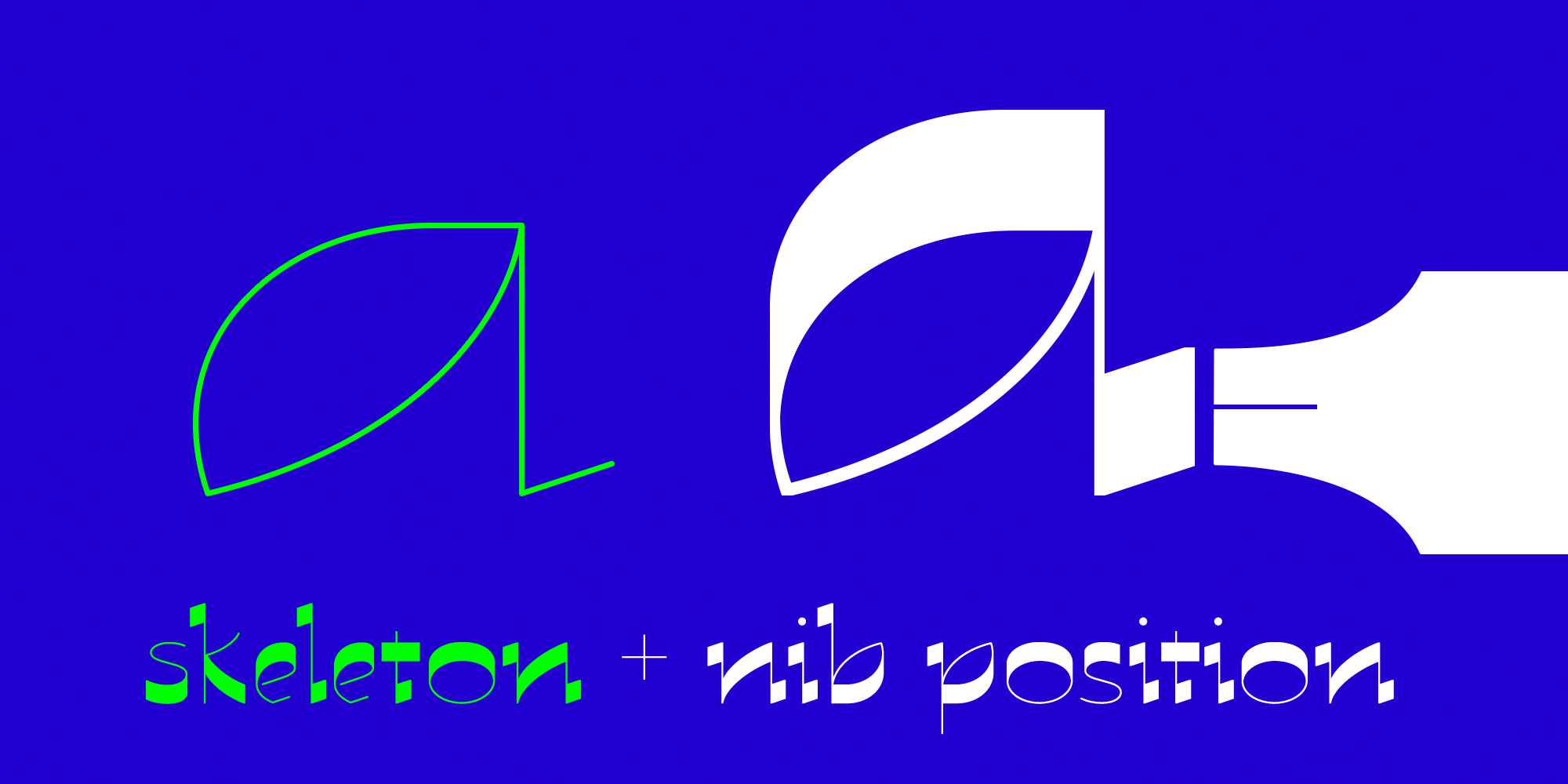
The three styles share the same concept for their skeletons. The Roko block skeleton is compressed to 50%, while the revers skeleton is streched to 150%.
The (virtual) calligraphy nib can be used in full-width or tilted on the corner for a thin, delicate stroke. The full-width strokes of Roko block utilise a strictly horizontal orientation, while the Revers strokes are oriented strictly vertically.

I finished my postgraduate studies for artists at Academy of Fine Arts Leipzig in 2022, and I am exctited to make Roko finally available to you to have fun and play with!